S2QL User Guide
Selector Software Query Language (S2QL) User Guide
Table of Contents
Main Query Structure and Keywords
Details On How to Fetch Data Relevant to Draw Insights
Supported Rendering Styles and Usage Examples
Introduction
This document provides a comprehensive guide to the Query Builder, a key tool on the Selector Platform designed for answering your questions about your network using efficient data retrieval and intuitive data visualization. This guide offers in-depth explanations of how S2QL works, its advanced techniques, as well as examples to help construct effective queries to get best insights from your data. Back to TOC
Main Query Structure and Keywords
The Query Builder employs a structured syntax and a set of keywords to precisely define how data is fetched and displayed. This guide examines how to select data and then shows how to render the data effectively for the insights in the most intuitive manner. There are 2 overall steps: fetching data and data rendering.
Fetching Data
Start by selecting the data you want to look at Any search involves the following four most important components:
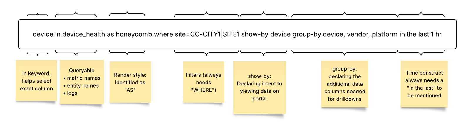
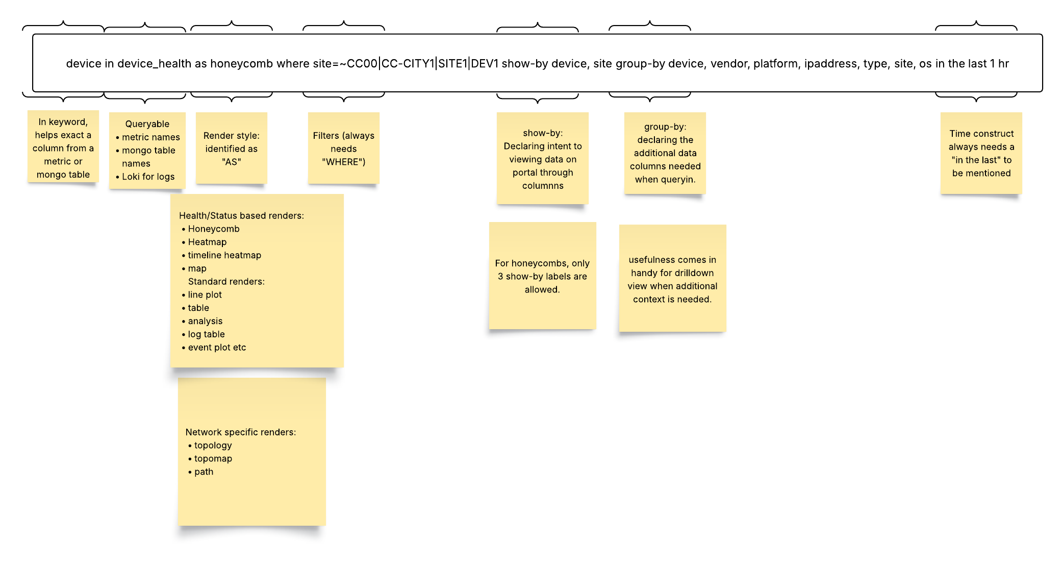
1. Data Source: where to search for data (called Queryables).
2. Filter conditions : what specific data you need for network insights (the where clause).
3. Specific data attribute : attributes of the data user is interested in (the in clause).
4. Time Range: the time range to use for the query.
The Selector platform collects and maintains data for long time periods (data retention timelines are configurable). This allows the platform to use ML to learn from past observations and to predict future behavior. The platform also supports network DVR operations to allow users to examine network conditions at a specific period in the past using the Time Range filter in the Query.
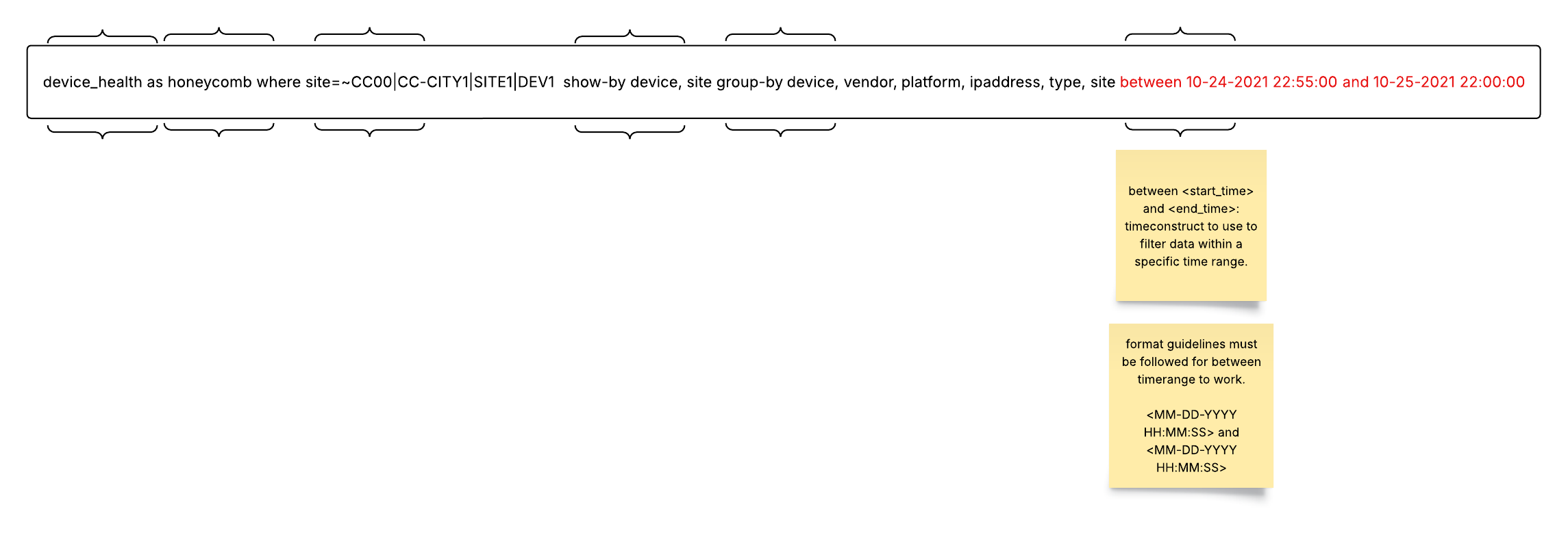
The following figure shows how the S2QL Queryable combines the where clause, the in clause, the time range, and some other organizing keywords (show-by, group-by) to create a widget to link to a dashboard on the Selector platform. All of these aspects of the S2QL are detailed in this guide. Note that the Queryable can be built using the UI or by typing.
Details On How to Fetch Data Relevant to Draw Insights
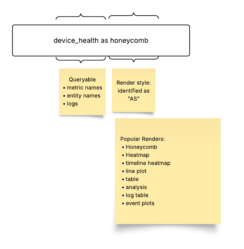
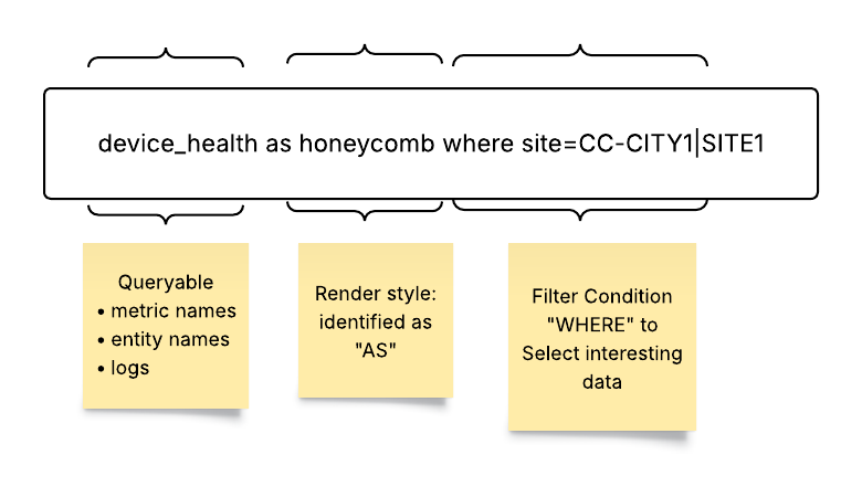
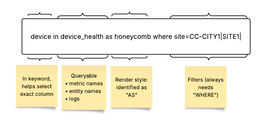
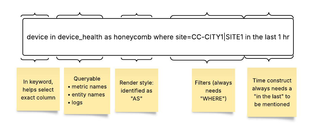
- Queryable (Data Source): A Queryable is one of the most important constructs of the Selector platform. ****The Queryable specifies the origin of the data being processed. This could be a metric from a time series database (stored in Prometheus), a table from inventory or events database (stored in MongoDB database), or enriched logs from Loki.
Syntax and Examples of filter condition:
Queryable: Flow_Count (Specifies a metric named Flow_Count - metrics are stored in Prometheus database)
Queryable: Application_Mapping (Specifies a table that stores entities and events. for example, Application_Mapping - stored in MongoDb database)
Queryable: syslogs (Specifies log data from Loki database)
- Where (Filter condition) : The where keyword (UI filter group) applies filters to the query, narrowing down the data by matching specified conditions. The where clause utilizes key-value pairs, comparison operators, and logical operators to create precise filtering criteria.
Syntax and Examples of filter condition:
where: site = ‘SITE1’ (Filters data with the site value equal to SITE1)
where: flow_count > 25000 (Filters data with the flow_count value greater than 25000)
where: direction = ‘DC internal’ or direction = ‘DC outbound’ (Filters data where the direction value is either DC internal or DC outbound)
Note that the where clause supports comparison operators (`=`, `!=`, `>`, `<`, `>=`, `<=`), logical operators (`and`, `or`), as well as regular expressions.
- In (Data Attributes): A Queryable points to a data source where enriched data resides in multiple attributes (or columns). To answer a specific question and to derive business insights, a user might want to select only specific attributes of the Queryable. The in keyword selects specific columns. Using attributes allows more targeted data retrieval, helping users to focus on the relevant aspects of the data to answer user questions and to generate insights.
Syntax and Examples:
site, device_type in (Selects the site and device_type columns from the Queryable)
response_time in (Selects the response_time column from the Queryable)
Note that if the in keyword is omitted, then all columns from the Queryable are retrieved and presented in table format.
- Time (Time Range): The time keyword defines the time range for the query. The range allows for historical analysis, real-time monitoring, or future projections.
Syntax and Examples:
time: last 30 minutes (Queries data from the last 30 minutes)
time: last 7 days (Queries data from the last 7 days)
time: between 03/25/25 12:00 and 03/25/25 13:00 (Queries data between 12:00 and 13:00 on March 25, 2025)
time: next 7 days (Queries data for the next 7 days; used for projections)
If the time clause is not explicitly mentioned in the query, the query picks the “time range” selected in the “time picker.”
Note that the time keyword in the Querable overrides any time window set in the UI.
To set a <start_time> and <end_time> time range, you must follow the MM-DD-YYYY HH-MM-SS format guideline.
Data Rendering
After fetching the selected data, it is equally important to render it in the most intuitive user-friendly way. The Selector platform allows many data rendering options.
Drop down menus show the rendering styles available for each metric on Query Builder UI.
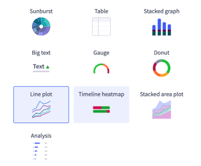
Drop down menus show the rendering styles available for each metric on Query Builder.

If you do not pick a rendering style, the S2QL picks what it thinks is the best way to render the data. All queries have a default rendering style. For example, an inventory database is always rendered as a simple table with rows and columns. You can render multiple Queryables on a line plot. For best results, limit the multiple queries to two or three at most.
Keywords for Selecting Render Types in Query Builder Bar:
- As: The as keyword (called renders in the UI) determines the visual representation of the queried data. The Query Builder supports a variety of render styles, each suited for different types of data and analysis. A complete list of all rendering options available on the platform is at the end of this chapter.
Syntax and Examples:
as Line Plot (Renders the data as a line plot)
as Table (Renders the data as a table)
as Honeycomb (Renders the data as a honeycomb)
Note that other available render styles include Heat Map, Timeline Map, Event Plot, Topology View, DOPO Map, Path, HTML Text, Big Text, Donut, and Sunburst. Some styles are not available in all Queryable data forms.
- Show-By: The show-by keyword is used to arrange and organize the visual elements (tiles or honeycombs) in the portal. It is particularly relevant for Honeycomb and Sunburst render styles.
Syntax and Examples:
- show-by site, device (Arranges the tiles or honeycombs by site, and then by device)
Advanced Query Capabilities
- Order-By: The order-by keyword facilitates drill-down analysis by querying additional columns from the backend. While order-by doesn’t impact the initial visualization, it provides contextual information when users drill down into the data.
Syntax and Examples:
- order-by device_type, location (Groups the data by device type. and uses location for drill-down)
- Group-By: The group-by keyword facilitates drill-down analysis by querying additional columns from the backend. While group-by doesn’t impact the initial visualization, it provides contextual information when users drill down into the data.
Syntax and Examples:
- group-by device_type, location (Groups the data by device type and location for drill-down)
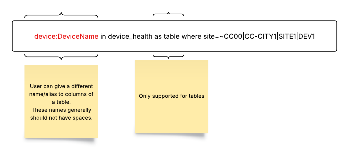
- Column Aliases: Column aliases allow assignment of user-friendly names to columns, enhancing the clarity and readability of the visualization.
Syntax and Examples:
device_health: Site Health (Assigns the alias Site Health to the device_health column)
Note that aliases have several important restrictions, as shown below:
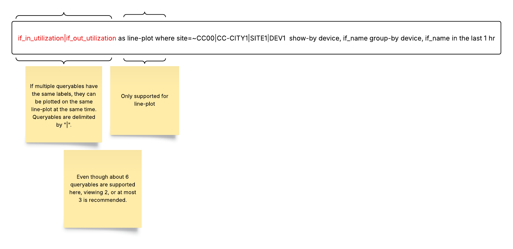
- Multi-Queryable: The Multi-Queryable feature enables the plotting of multiple metrics on a single line plot. It is exclusively supported for the Line Plot render style.
Syntax and Examples:
Queryable: Metric1 | Metric2 (Plots both Metric1 and Metric2 on the same line plot)
Note that the metrics must share the same set of labels or a similar family of labels for this feature to work correctly. These restrictions are shown below:
5. Aggregation Queries: This feature provides statistical insights into numerical values stored in a mongo table. Use cases include reporting based on availability, roll-up tables, and entity-related data like uptime availability. For example, if device availability is a numerical value in the inventory table, this function allows end users to see “average” device availability over a selected time window. Aggregation is not supported for metrics or logs
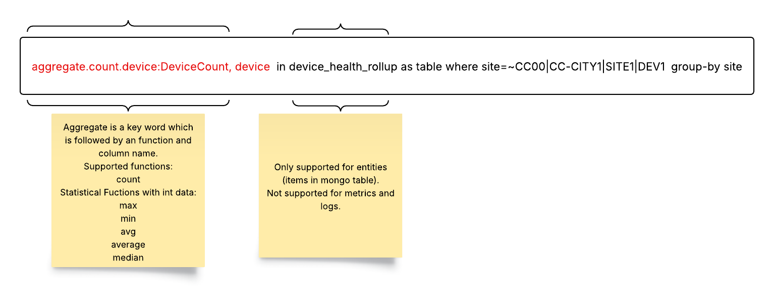
To use aggregate functions, start with the aggregate keyword.
Follow with the function (for example, count).
End with the column name (for example, device).
The following Aggregate Functions are supported:
count: this provides the count of unique instances that match a given filter condition
max: the maximum value of the set that matches a filter condition (default)
min: the minimum value of the set that matches a filter condition
median: the median value of the set that matches a filter condition
avg / average: the average value of the set that matches a filter condition
Using count with aggregate is a powerful combination. It provides the count of unique occurrences of instances (label) that match the filter/group by condition. Every unique instance and the corresponding number of occurrences for that filter condition is shown in the result.
Here is an example using aggregate.count in abc_table as a table group-by abc_number:
Query: aggregate.count in abc_table as table group-by abc_number

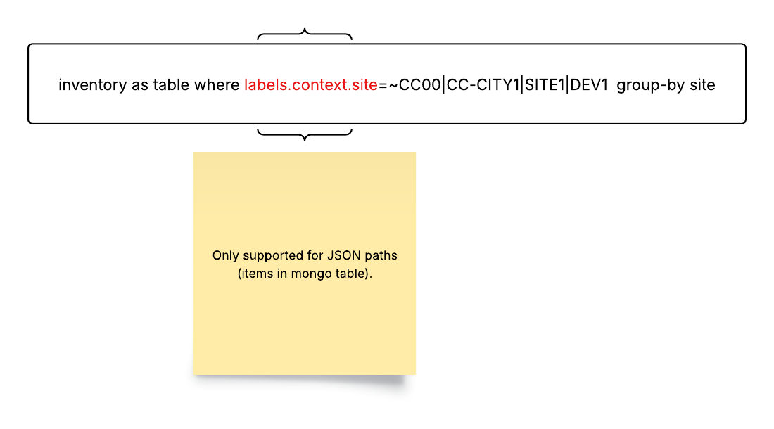
6. Nested Queries: Nested queries are used to filter information within a JSON structure. In the where clause, you can specify a nested filter within a JSON structure as shown below:
Best Practices for Queryables
Use Meaningful Aliases: Assign clear and descriptive aliases to columns for better understanding.
Leverage Filtering: Utilize the where clause to focus on specific data subsets.
Optimize Time Ranges: Choose appropriate time ranges for your analysis to avoid excessive data retrieval.
Explore Visualizations: Experiment with different render styles to find the most suitable representation for your data.
Validate Your Queries: Regularly test and validate your queries to ensure accuracy and efficiency.
Supported Rendering Styles and Usage Examples
Standard Data Rendering Styles
| Render Style | Description | Example Usage |
|---|---|---|
line-plot 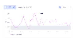 | Data is generically rendered as a series of connected points | Numerical metrics packets transmitted traffic volume |
table  | Data is rendered as a simple array of rows and columns | tabular view of inventory |
log-table  | Data in log events is rendered in a simple table of rows and columns | Viewing frequency of syslogs and events over time grouped by severity. |
big-text 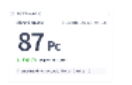 | Data is rendered as text with font proportional to the predominance of the information | Important highlights: Network availability Network uptime |
donut  | Data is rendered as a hollowed-out pie chart with color proportions equal to the predominance of the information | Piechart view : Device availability |
gauge 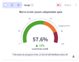 | Data is rendered as a type of speedometer arc | Speedometer view: Device availability |
stacked-area-plot 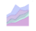 | Data is rendered as a series of lines stacked and coded to show the separation of values as areas | Average CPU usage by site. |
event-plot 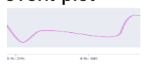 | Events are generically rendered as a series of points connected by lines | Events: Events ordered by time |
stacked-event-plot  | Events are rendered as a series of lines stacked and coded to show the separation of values as areas | Events Events are ordered chronologically and grouped by frequency |
sunburst 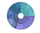 | Data is rendered as a radial treemap (multi-level pie chart) organized as a set of nested rings | Vendor distribution KPI breakdown of a device |
analysis  | Categorical and numerical distribution of the data that is being rendered | Distribution of alert events to find the most common alert |
Render Styles Ideal for Showing Health Status
| Render Style | Description | Example Usage |
|---|---|---|
map  | Data is rendered on a map. This is a special format. | Showing health of devices across the US based on latitudes and longitudes. |
threshold-violation-matrix 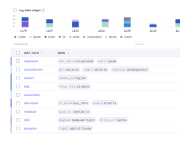 | Data is rendered as color-coded areas from “cold” to “hot” to emphasize violations | Packet drops, latency, and availability across different sites |
honeycomb 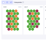 | Data is rendered in six-sided cells to emphasize violations. | Important high-lights: Device status Site status |
timeline-heatmap 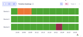 | Data is rendered along a time line as a color range from “cold” to “hot” | change of health of device over period of time |
Render Types Ideal for Network Visualization
| Render Style | Description | Example Usage |
|---|---|---|
topology 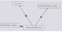 | Network date is rendered as a plot of connected devices, sites, or other equipment | BGP adjacency connections between ASNs |
topomap 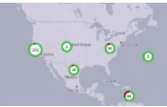 | Network data is rendered as a plot of connected devices, sites, or other equipment against a geographical map | BGP adjacency connections between ASNs shown on a world map based on latitudes and longitudes. |
path  | Network data is rendered as a directional graph. This is a special format. | Displaying the intermediate hops in a segment routing path based on user defined source and destination sites. |
pathmap 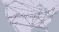 | Network data is rendered as a directional graph on a map. This is a special format. | Displaying the intermediate hops in a segment routing path on a world map based on defined latitudes and longitudes. |