This is the multi-page printable view of this section. Click here to print.
Selector S2AP Operations Guide
- 1: Selector S2AP Operations Guide - Access and Dashboards
- 2: Selector S2AP Operations Guide - Widgets
- 3: Selector S2AP Operations Guide - Integrations and Alerts
1 - Selector S2AP Operations Guide - Access and Dashboards
Selector Software Operations - Access and Dashboard
Selector Software Operations Guide - Part 1
This part of the S2AP Operations Guide describes the fundamentals of day-to-day access and dashboard operation for the S2AP platform from Selector AI Software. This part of the guide is divided into several major parts:
- Accessing the Selector S2 Platform
- Dashboards and Dashboard Folder Creation
- Modifying Dashboard Configuration Settings
Some related features, such as widgets and maintenance windows, are covered in other documentation. Links to these documents are provided where appropriate.
Accessing the Selector S2 Platform
The deployed Selector platform (S2) platform is available from any browser with network access, although we recommend use of the Chrome browser. Details such as login URL and credentials are obtained from your account’s Solutions Engineer or Customer Success Engineer. Once you have this information, navigate to the provided URL and enter the credentials.
Logging into the S2 Platform
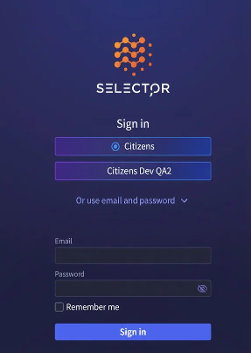
The sign in page looks like this:
Selector Web Portal Home Dashboard
Once logged in, users are taken to the Home Dashboard. The home dashboard serves as the central hub or starting point for users with the following goals in mind:
Data visualization—The home dashboard visually presents essential data and metrics in a consolidated and easy-to-understand format. It allows users to monitor and analyze important information at a glance, providing a snapshot of the current status and performance of various aspects of their operations.
Personalization—The home dashboard can be customized based on user preferences and roles. Users can select and arrange widgets or modules according to their specific needs, ensuring that the most relevant and important information is readily available.
Quick access to features—The home dashboard includes shortcuts that allow users to access frequently used features or perform common actions with just a few clicks. It provides a centralized location for users to navigate to different areas of the software quickly, streamlining their workflow and saving time.
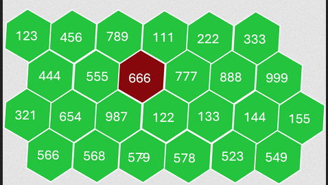
The S2 home dashboard usually displays a honeycomb fomat like this:
Main Menu
The Main Menu is on the left side of the interface. The main menu serves as the primary navigation tool, providing users with access to various features and modules within the software.
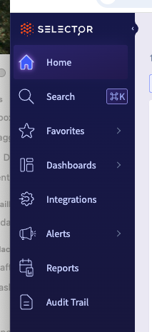
From top to bottom, the main menu item icons are:
Home—The home link always brings users back to the home dashboard.
Search–This lets users search for words and phrases that are used in various dashboard and widgets. You can search for pages, settings, or profiles.
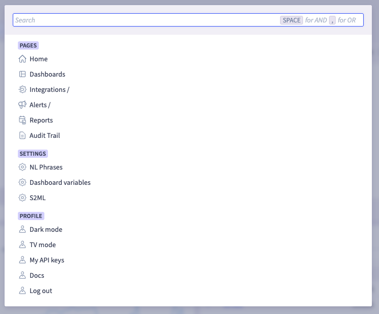
Favorites—The Favorites link will display a list of dashboards which have been marked as “favorite” from the dashboard configuration screen, as shown below.
Dashboards—The dashboards link will provide users with a list of all configured dashboards. You can designate a dashboard as global. If a dashboard is configured as global, all users of the S2 platform can view that dashboard. Dashboards can be grouped into folders.
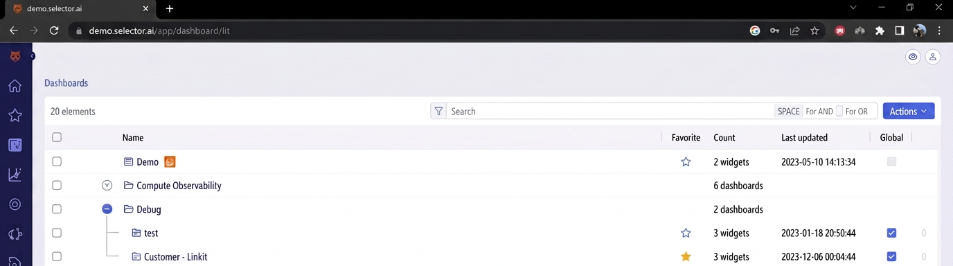
Forecast—This takes users to the S2 platform’s Forecast Dashboard. NOTE: Generally, this dashboard is unused until the user’s S2 environment has moved well into the correlation phase of their deployment and baselined trends have been established.
Integrations—This takes users to the integrations interface. From there, the S2 platform integrations can be defined, adjusted or tested.
Alerts—This provides users with a list of various alerting sub-menus. Each of the following are covered in detail later:
Rules
Events
Suppressed Events
Incidents
Maintenances
Acknowledgements
Reports—This takes user to a series of reports that are available.
Audit—This takes users to a dashboard populated by the Audit Logs widget. This widget displays all user-driven platform events such as logins, updates, item creations (such as widgets, dashboards, notification providers, and so on), as well as screen captures.
The Dashboards Interface
The dashboards interface lets users create, modify and delete dashboards. This interface also allows users to designate a dashboard as a “Favorite” dashboard.
Dashboards and Dashboard Folder Creation
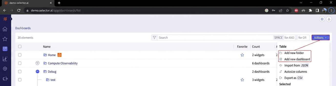
The Actions icon at the top right of the dashboards page gives the user a list of possible actions.
To create a new dashboard, select Add new dashboard. To create a new Dashboard Folder, select Add new folder.
Creating a New Dashboard
To create a new dashboard, follow the steps below:
- Navigate to the dashboards menu if you are not there already.
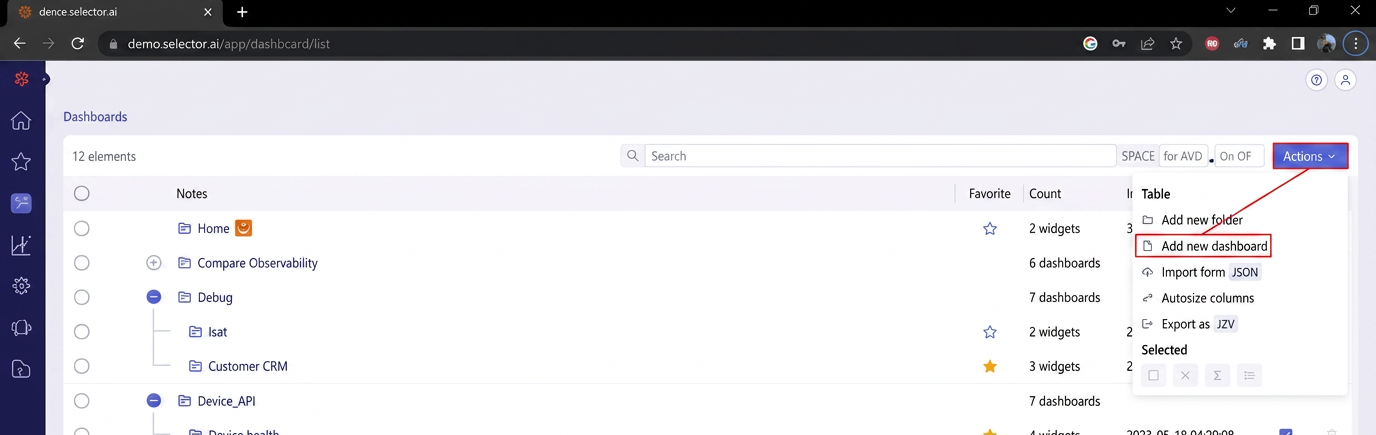
- Click Actions at the top right of the page.
- Select Add new dashboard from the drop-down menu:
- Another menu assists in the creation of the dashboard. First enter the dashboard name.
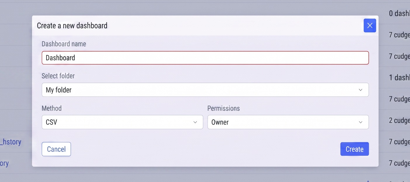
In this case, the name entered is Example.
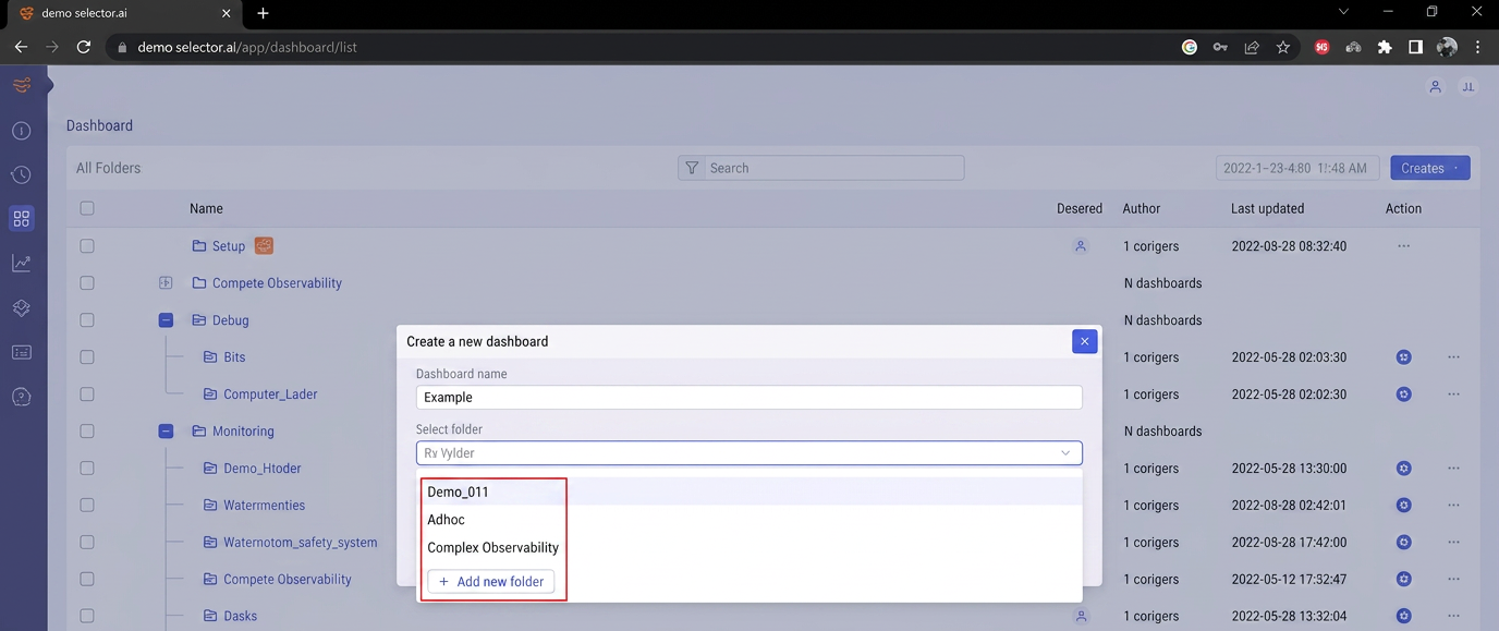
- If the dashboard is intended to be a member of a specific dashboard folder, select the appropriate dashboard folder from the drop-down list. Alternatively, a new dashboard folder can also be created:
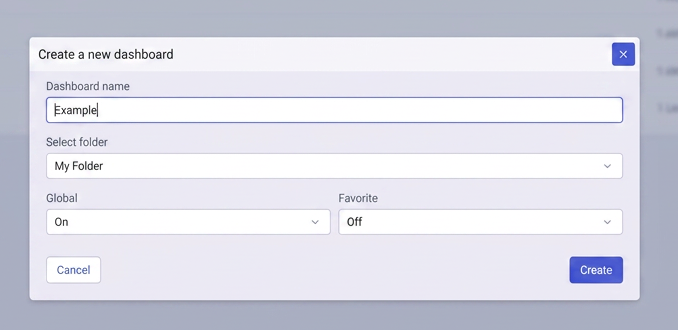
- If the new dashboard is intended to be seen by all users of the S2 platform, enable the Global setting. If not, disable the Global setting:
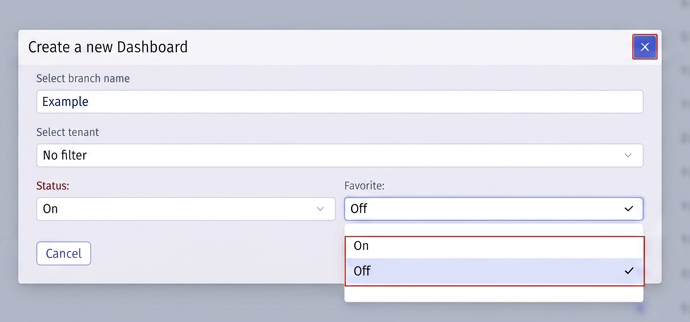
- Configure the Favorites setting. if the dashboard should be included in the Favorites list, set this to On. Otherwise, set this option to Off.
- Click Create to create the dashboard:
If the creation is successful, a message appears at the top right of the screen to confirm the creation of the new dashboard:

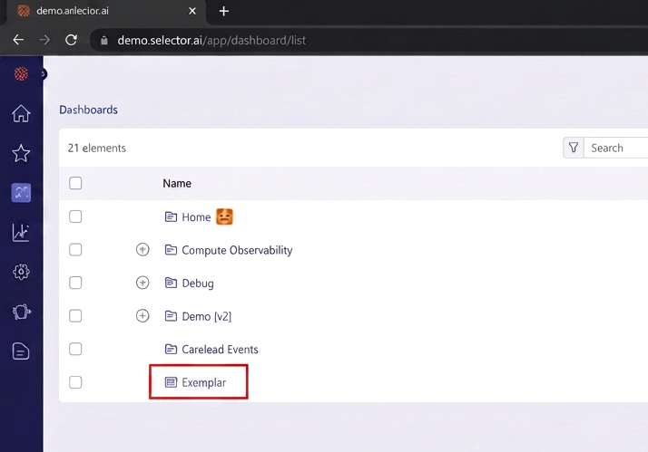
The new dashboard (Examplar) appears in the dashboard list:
Creating a New Dashboard Folder
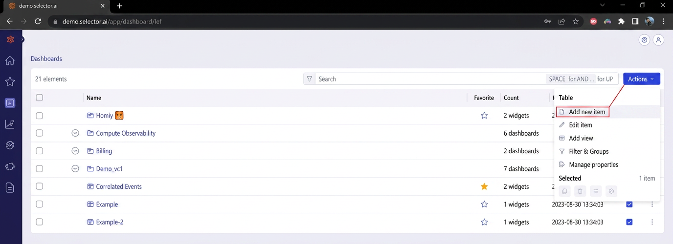
You can create new dashboard folders as part of the dashboard creation workflow. A new dashboard folder is created by navigating to the dashboard list, selecting Actions at the top right of the dashboard interface and then selecting Add new folder:
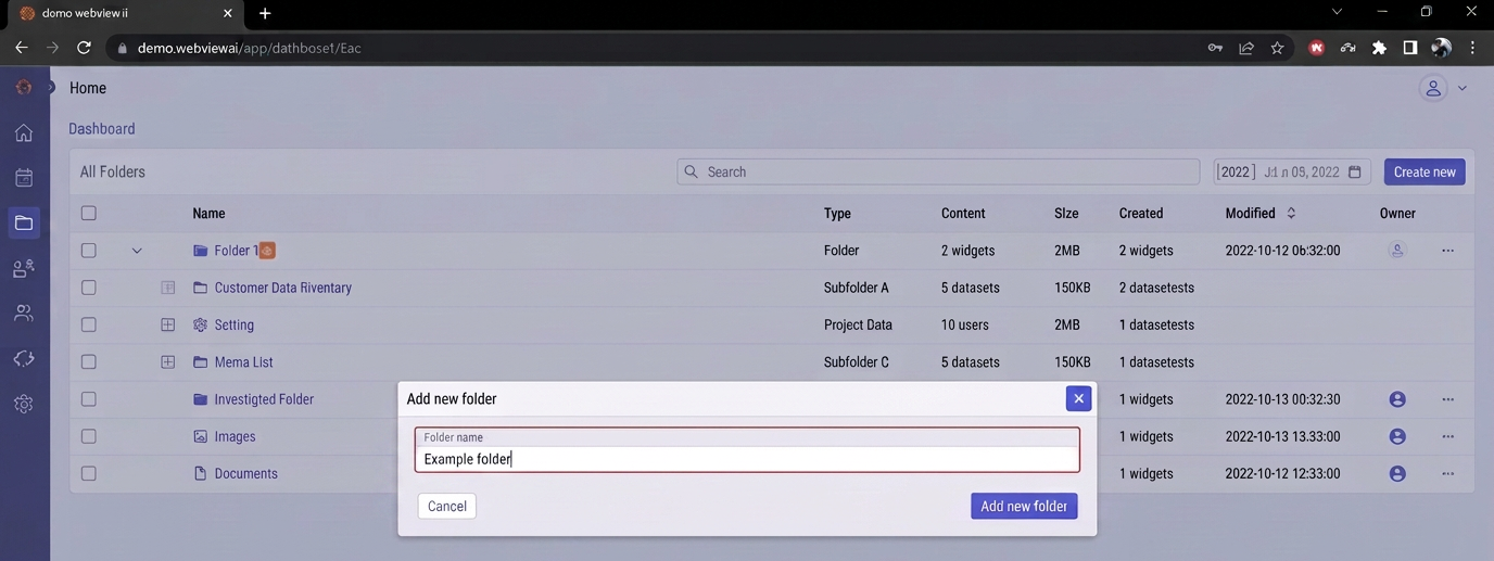
A dialog box prompts the user to enter the folder name. Enter the name and then click the Add new folder button:
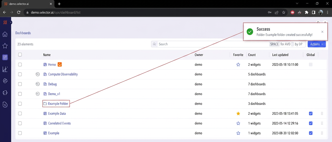
If the new folder was successfully created a confirmation message appears and the new folder appears in the dashboard list. Dashboards can be created in the folder directly or existing dashboards can be moved into that folder by adjusting their configuration properties:
Modifying Dashboard Configuration Settings
If you want to change a dashboard’s configured name, folder membership, global or favorite setting, first navigate to the dashboard list and locate your dashboard.
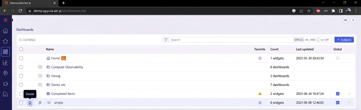
Hover the mouse over the left side of the list to reveal a slide out list of options:
- Edit
- Delete
- Export
To modify the dashboard’s configuration settings, select the Edit option to display the dashboard’s details:
The following options can be changed:
- Dashboard name
- Dashboard folder membership
- Global setting
- Favorite setting
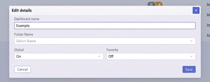
When the changes have been entered, click Save.
Using Dashboard Quick Actions
The Dashboard interface provides three quick actions:
- Page search
- Add dashboard to favorites
- Share dashboard

Using the Page Search Quick Action
A dialog box containing a text prompt appear after clicking the Page Search icon:
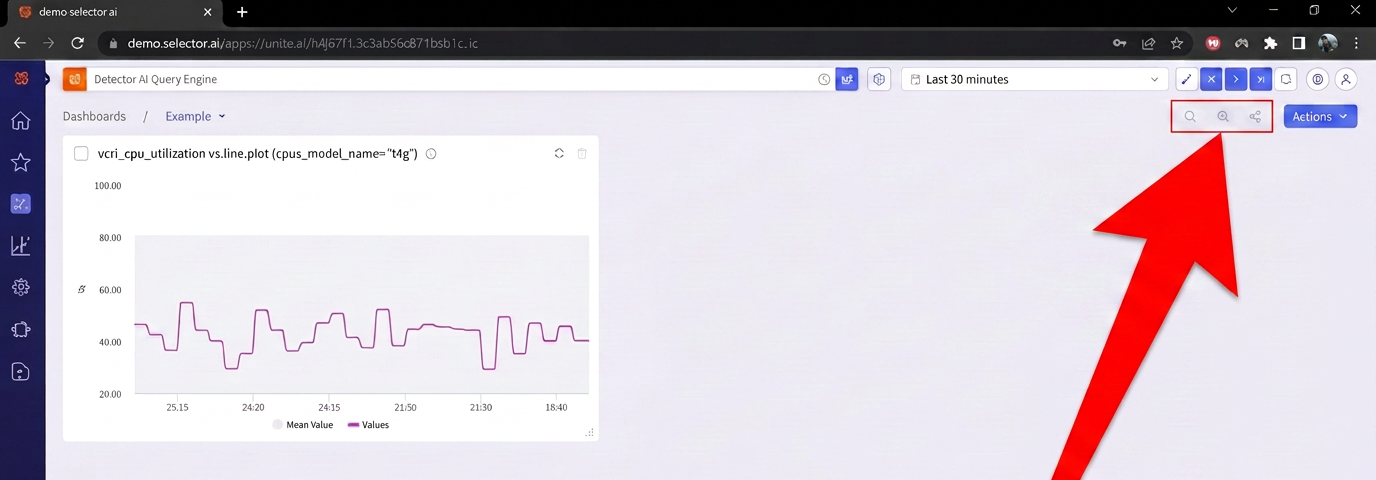
Enter the search criteria and press Enter. Note that SPACE is used to combine terms with for AND. A comma (,) is used to combine terms with an inclusive OR.
For example, to search for CPU and memory, enter CPU memory.
To search for CPU or memory, enter CPU,memory.
This is not an exclusive OR (XOR).
Using the Add Dashboard to Favorites Quick Action
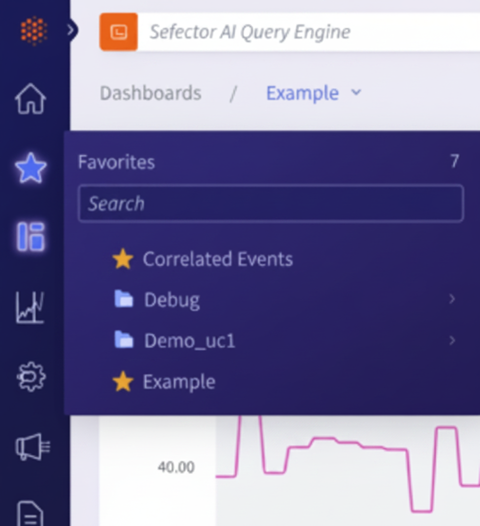
Clicking the Add Dashboard to Favorites icon adds the current dashboard to the Favorites dashboard list:

Once added, the blue star turns gold:
The added dashboard (“Example”) now appears in the list of dashboards on the Favorites menu:
Using the Share Dashboard Quick Action
Clicking the Share Dashboard quick action icon copies the URL of that dashboard to the system’s clipboard.
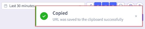
Once the Share Dashboard quick action icon has been clicked, a message appears confirming that the URL for the dashboard has been copied to the system’s clipboard.
Adjusting a Dashboard’s Position in the Dashboard List
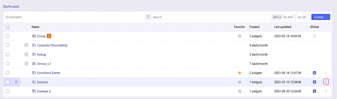
Dashboards can be moved up and down in the dashboard list by clicking on it, then dragging up or down on the dots associated with the dashboard:
Exporting a Dashboard
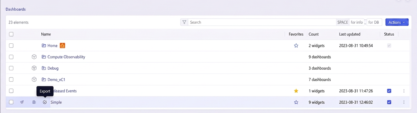
Dashboards can be exported in two formats: JSON and CSV. To export a dashboard to either format, navigate to the dashboard list, locate the dashboard in question, and hover your cursor over the left side of the entry. Then click on the Export icon on the right side of the slide-out menu, as shown below:
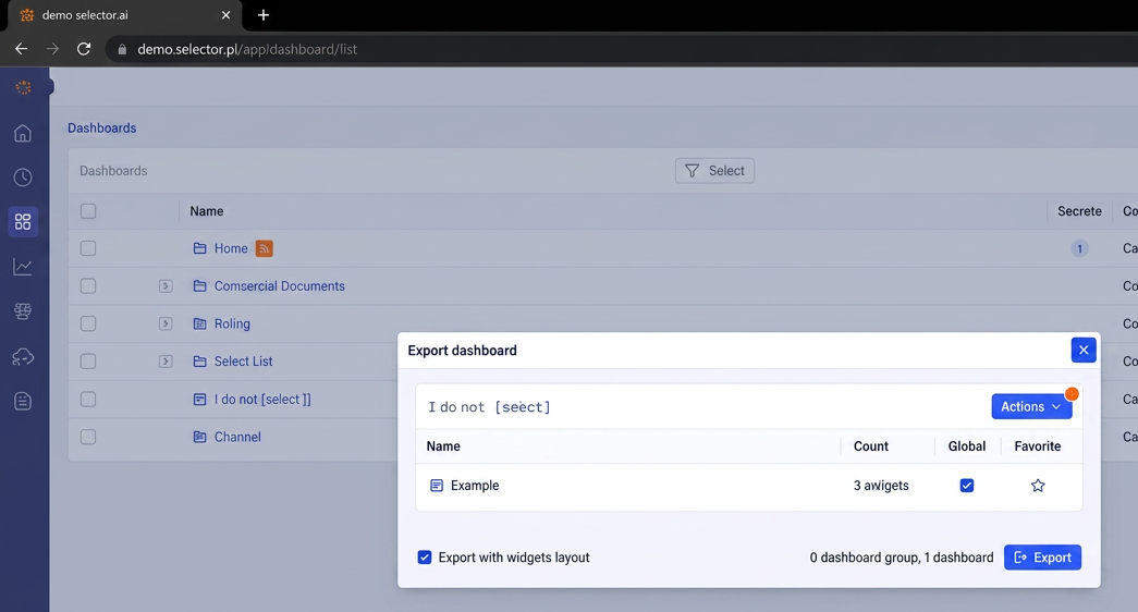
Once the Export option has been clicked, the Export Dashboards panel appears:
At this point, the Actions button provides two options:
- Autosize columns
- Export as CSV
These options are shown below:
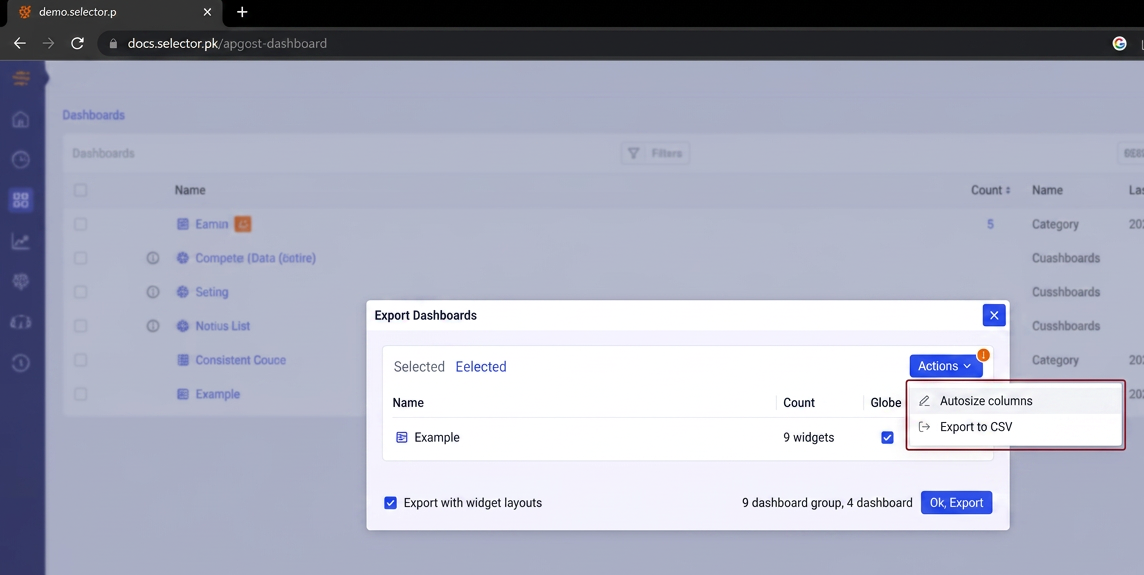
When the Export as CSV option is clicked, a CSV file is downloaded:
When exporting the dashboard as a JSON file, there are two configuration options defined:
- Global
- Favorites
Additionally, you can select specific widgets from a dashboard. There is also a checkbox allowing preservation of the widget layouts (box on lower left):
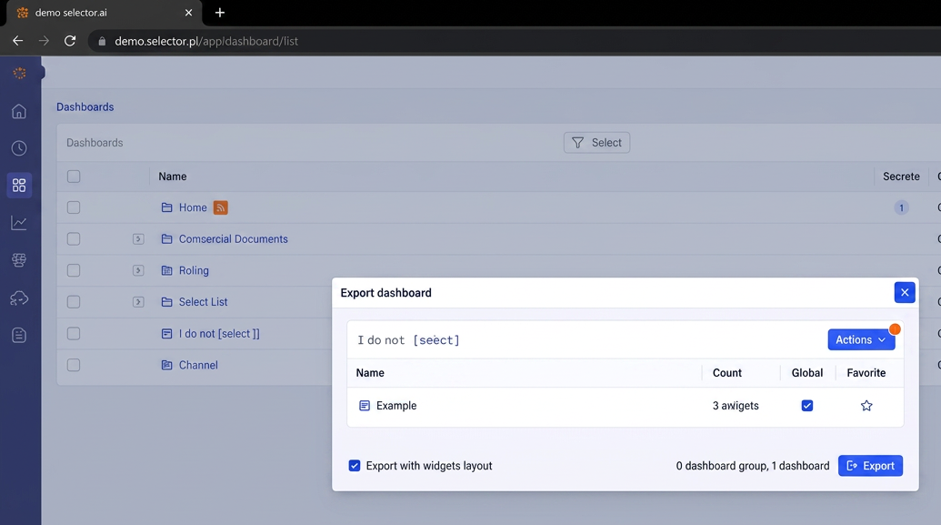
After the configuration options have been selected, click the Export button to export the JSON file:
Importing a Dashboard JSON File
To import a dashboard JSON file, navigate to the dashboard list, and click the Action button at the top right of the display. Then click Import from JSON:
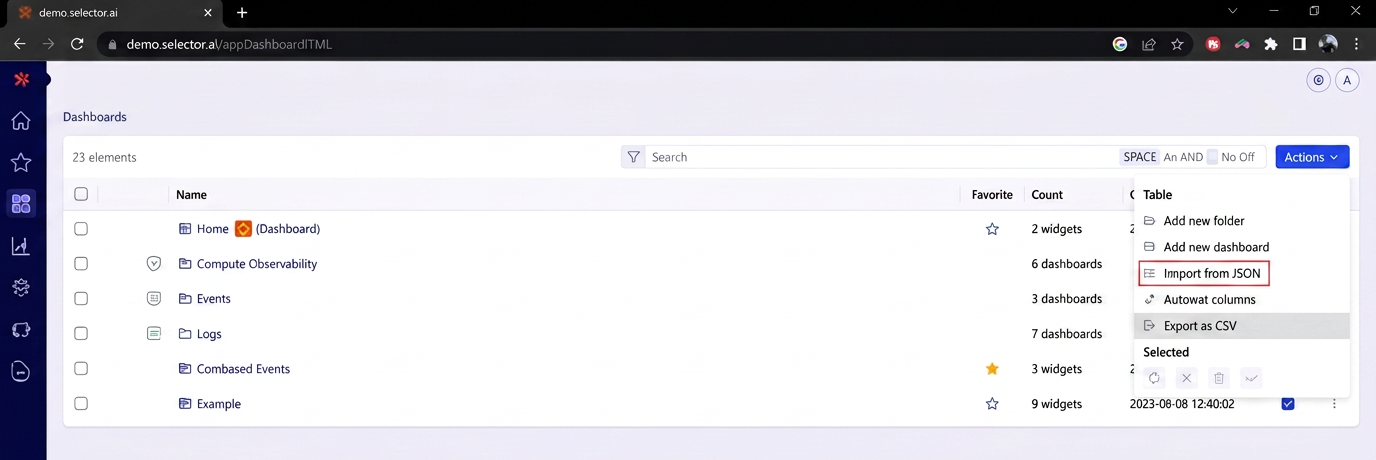
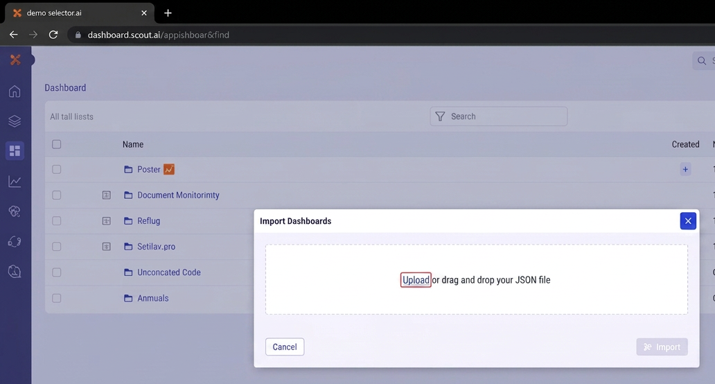
A dialog box appears. Click Upload File:
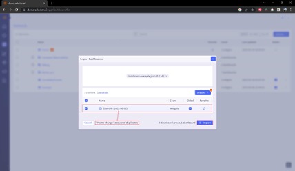
The dialog updates automatically. The dialog box allows modification of the Global and Favorite setting of the dashboard. Update these and then confirm that the correct file is selected. Note that because we are importing a dashboard named Example, which already exists, a message appears informing the user that the name of the widget is updated to include the import data in its name. Once everything looks correct, click Import:
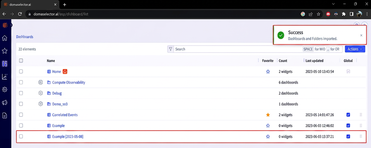
If the import is successful, a message is displayed showing the outcome:
Deleting a Dashboard
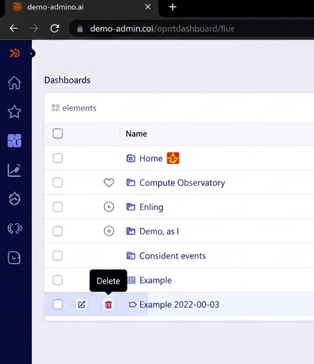
To delete a dashboard, navigate to the dashboard list and locate the desired dashboard. Hover over the left side of the dashboard name and select Delete, as shown in the following:
A new dialog box appears confirming the name of the dashboard to be deleted and warning the user that the deletion action cannot be undone. After verifying that the correct dashboard has been selected, click Delete:
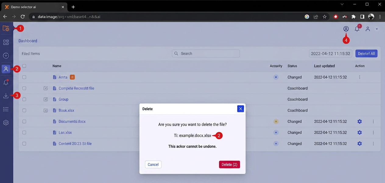
A message appears informing the user that the deletion was successful. The deleted dashboard no longer appears in the Dashboard list:

Dashboard Actions
The Actions menu of the dashboard interface provides a list of user actions related to dashboards:
Generate AI Summary
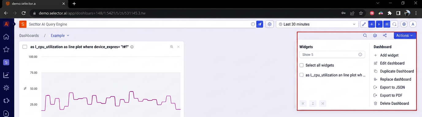
One of the things you can do for dashboards and some other levels like syslogs, is to quickly generate an AI summary of the dashboards and widget (and syslogs) in an easy-to-read format, This allows a users to see a fast summary of conditions with a lot of drilldown into details. The text appears in the right margin of the screen.
Invoke the AI summary feature by clicking the Generate AI Summary button near the dashboard actions menu:
Actions Menu
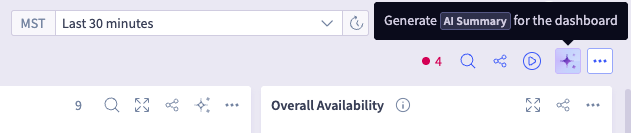
The Actions menu provides two possible sets of actions:
- Widget selection
- Dashboard actions
Both are shown below:
Widget Selection
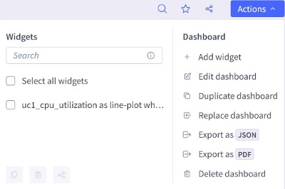
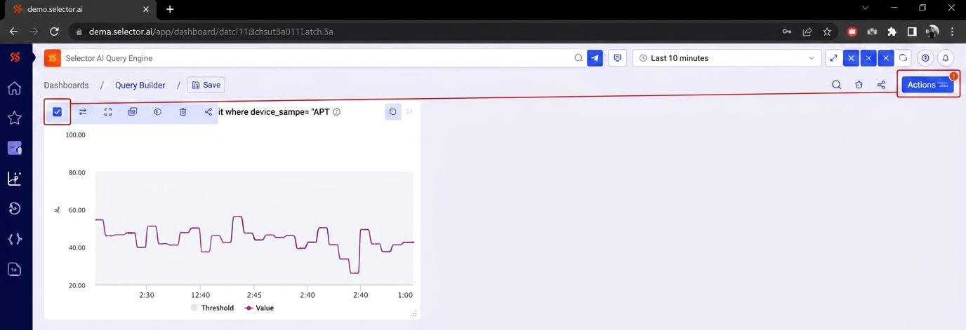
Dashboard widgets must be selected to modify them. To select widgets, click the checkbox by the desired widget. Once the widget’s checkbox is checked, a small exclamation mark will appear on the Actions menu icon;
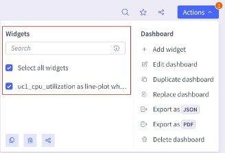
Clicking the Actions button reveals the Actions menu. Note that the widget has been selected, The All widgets checkbox is selected as well because it was the only widget in the dashboard:
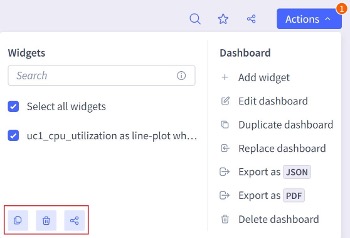
Once a widget selection has been made, three icons appear at the bottom left of the Actions. These are, from left to right:
Copy widget
Delete widget
Share widget
These widget actions are covered in detail in the Working with Widgets section.
Dashboard Add Widget
The first option in the list of dashboard actions is add widget. Clicking this option opens the Query Builder interface to create the widget. Once created, the widget can be added to the dashboard. This addition is covered in the Widgets and Dashboards section.
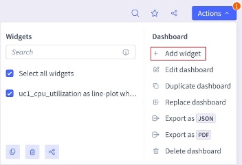
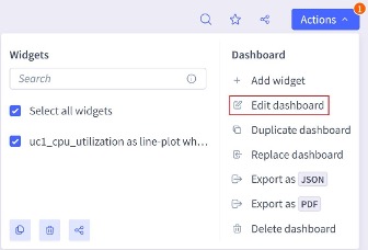
The second option in the list of dashboard actions is Edit dashboard. This selection opens the dashboard configuration interface. Use of the dashboard configuration interface is covered in the Modifying Dashboard Configuration Settings section:
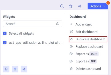
The third option in the list of dashboard actions is Duplicate dashboard. This selection opens the dashboard duplication interface:
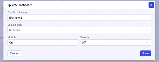
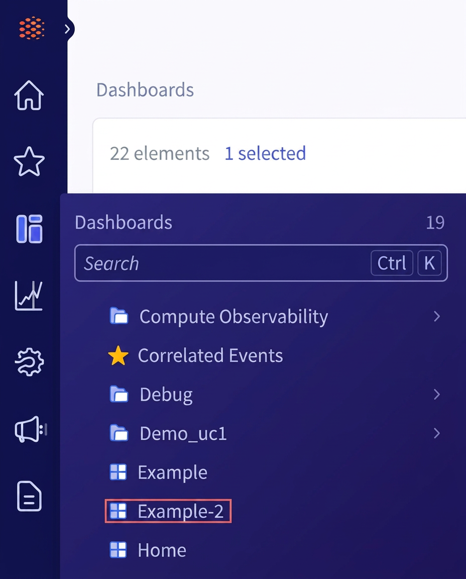
The dashboard duplication interface allows the user to create a new copy of the current dashboard. The user enters the new name (in this case the new name is Example-2), selects a dashboard folder (if required) and configures the Global and Favorite settings:
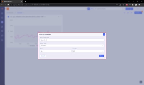
When the configuration for the destination dashboard is complete, click Save:
A message appears confirming the creation of the new duplicate dashboard:

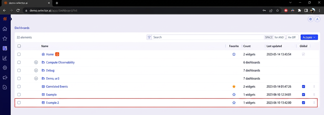
The new dashboard can now be viewed in both the dashboard list and dashboard menu (in this case, Example 2):
2 - Selector S2AP Operations Guide - Widgets
Selector Software Operations - Widgets
Selector Software Operations Guide - Part 2
This part of the S2AP Operations Guide describes the fundamentals of widget operation for the S2AP platform from Selector AI Software. This part of the guide is divided into several major parts:
Some related features, such as dashboards and maintenance windows, are covered in other documentation. Links to these documents are provided where appropriate.
Widgets, Dashboards, and Query Builder
Widgets provide the representation and abstraction of data ingested by the S2 platform. By default, unless the dashboard was imported from a JSON configuration file, a new dashboard contains no widgets.
Widget Creation
To create a widget, navigate to the empty dashboard and click the Add Widget button:
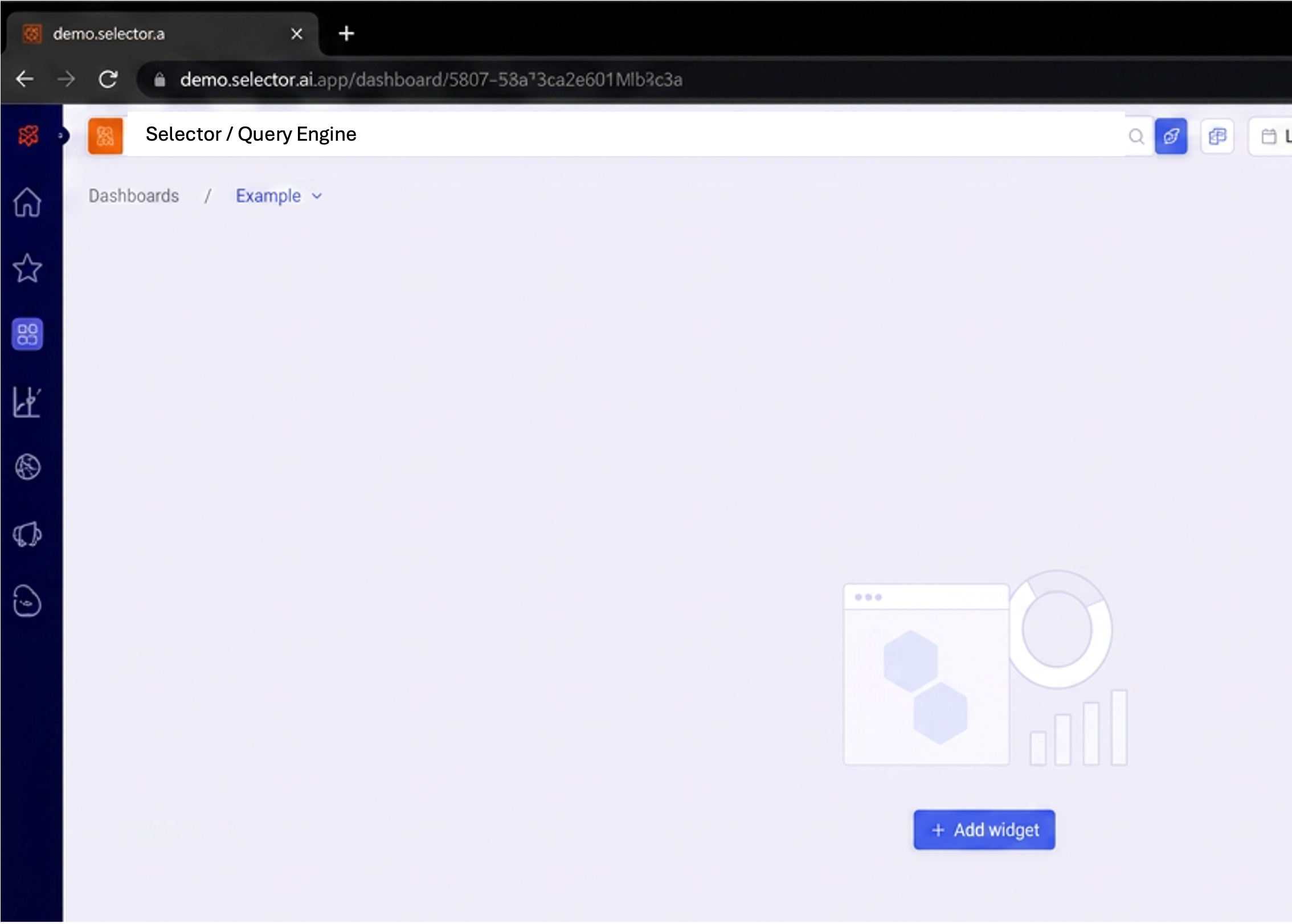
After clicking Add Widget, the Query Builder interface appears.
Note: Custom documentation on how to use the query builder is created and shared on a per-customer basis. Please see your Customer Success Engineer for this documentation.
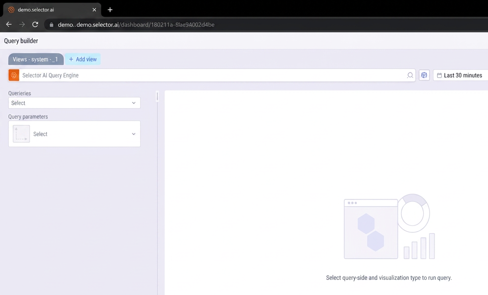
Widgets and the Query Builder
You use the Query Builder to define and preview the desired widget. However, the detailed usage of the Query Builder has its own detailed instruction document. Only the basic process is covered here. For more information, please see:
Selector Software Query Language (S2QL) User Guide
Generally, you use the Query Builder to define the following components:
- The queryable metric/KPI/log file: uc1_cpu_utilization
- A visualization type: Line Plot
- Any filters: device_name =~ .*NF.*
As the values are selected, the query is generated in the Query Builder. In this case, the following S2QL query is generated:
wc1_cpu_utilization as line-plot where device_name=~.*NF.*
The timeframe of the widget is defined in the Query Builder. In this case, the default value of 30 minutes is used.
Once the query is defined, click the Run Query icon in the Query Builder This generates the line plot widget as shown below:
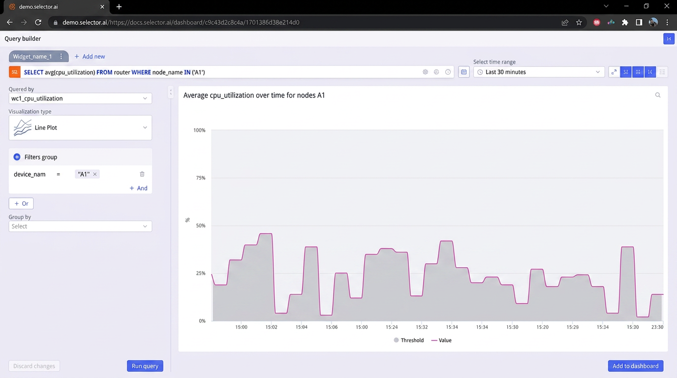
Note that it is possible to create multiple tabs in a widget. In this example, only one tab is used.
Adding the Widgets to the Dashboard
Once the user is satisfied with the widget’s output, click the Add to dashboard icon of the Query Builder:
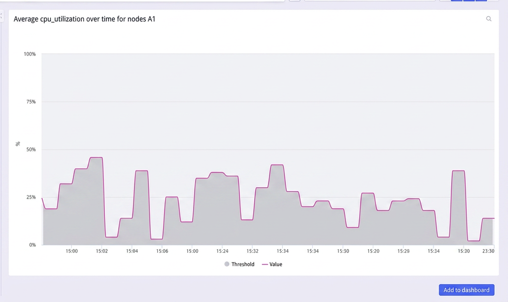
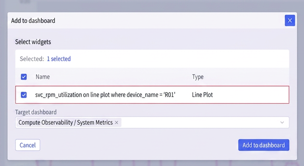
A dialog box appears, and a selection is presented to allow the user to choose the query or widget for the dashboard. If multiple tabs are created in the Query Builder, they re all displayed and selectable here:
Next, scroll down and locate the desired target dashboard. In this case, the Example dashboard is selected:
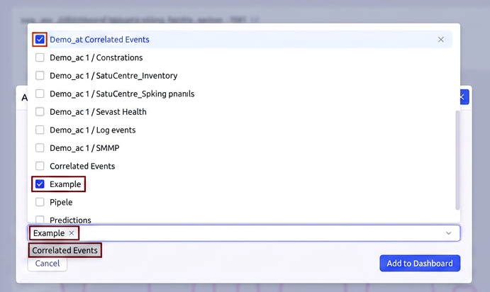
Once everything looks good, click Add to dashboard in the dialog box:
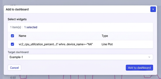
A message appears stating that the operation was a success. At the same time, the user is taken to the updated dashboard where the added widget is visible at its default size:
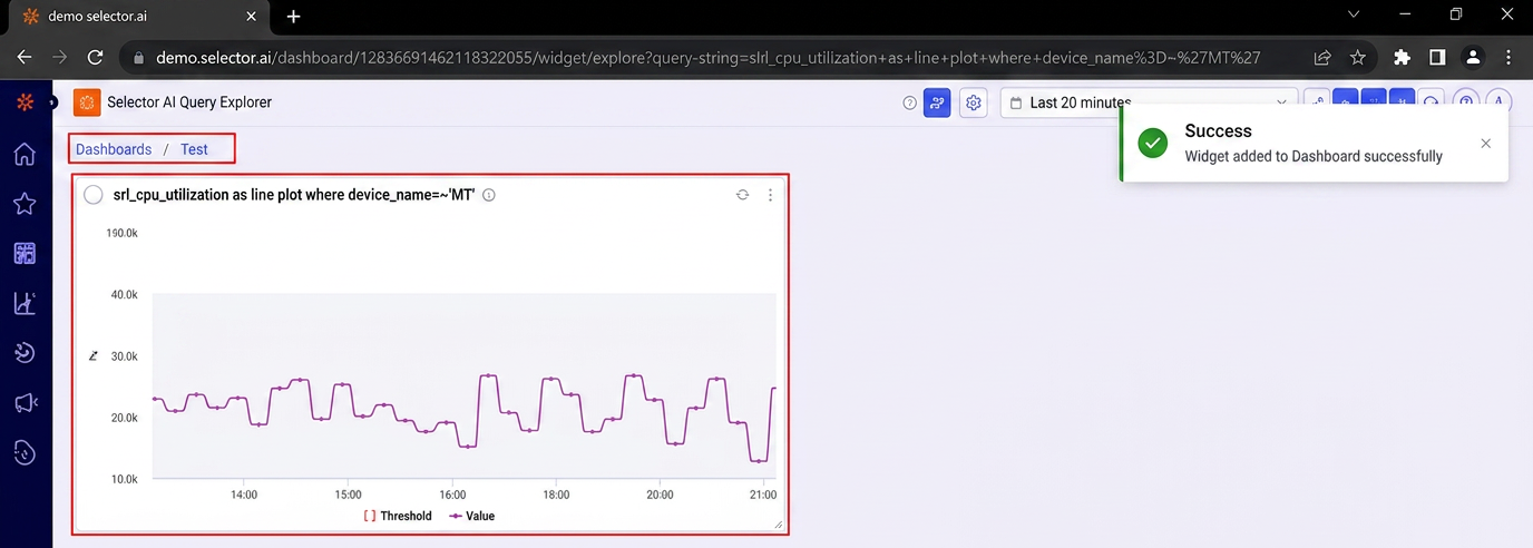
You can resize the widget by clicking the bottom right corner of the widget and dragging the size to the desired scale.
The user can also click and drag the top of the widget to move it to the desired location in the dashboard. The widget has been resized below to fill the visible screen:
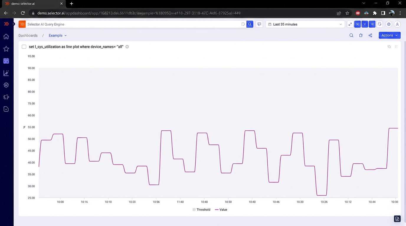
Working with Widgets
Widgets have several operations associated with them. Hovering over the name of a widget produces a slide-out menu containing the following optional operations:
- Query the widget with a natural language phrase using S2 Query Language (S2QL)
- Editing a Widget
- Maximizing a Widget
- Copying a Widget
- Deleting a Widget
- Sharing or Exporting a Widget
- Searching a Widget
The above options are detailed below.
Querying a Widget Using S2 Query Language (S2QL)
You can use a natural language phrase for a Widget’s S2QL query. This allows a user to more quickly formulate a widget’s S2QL query.
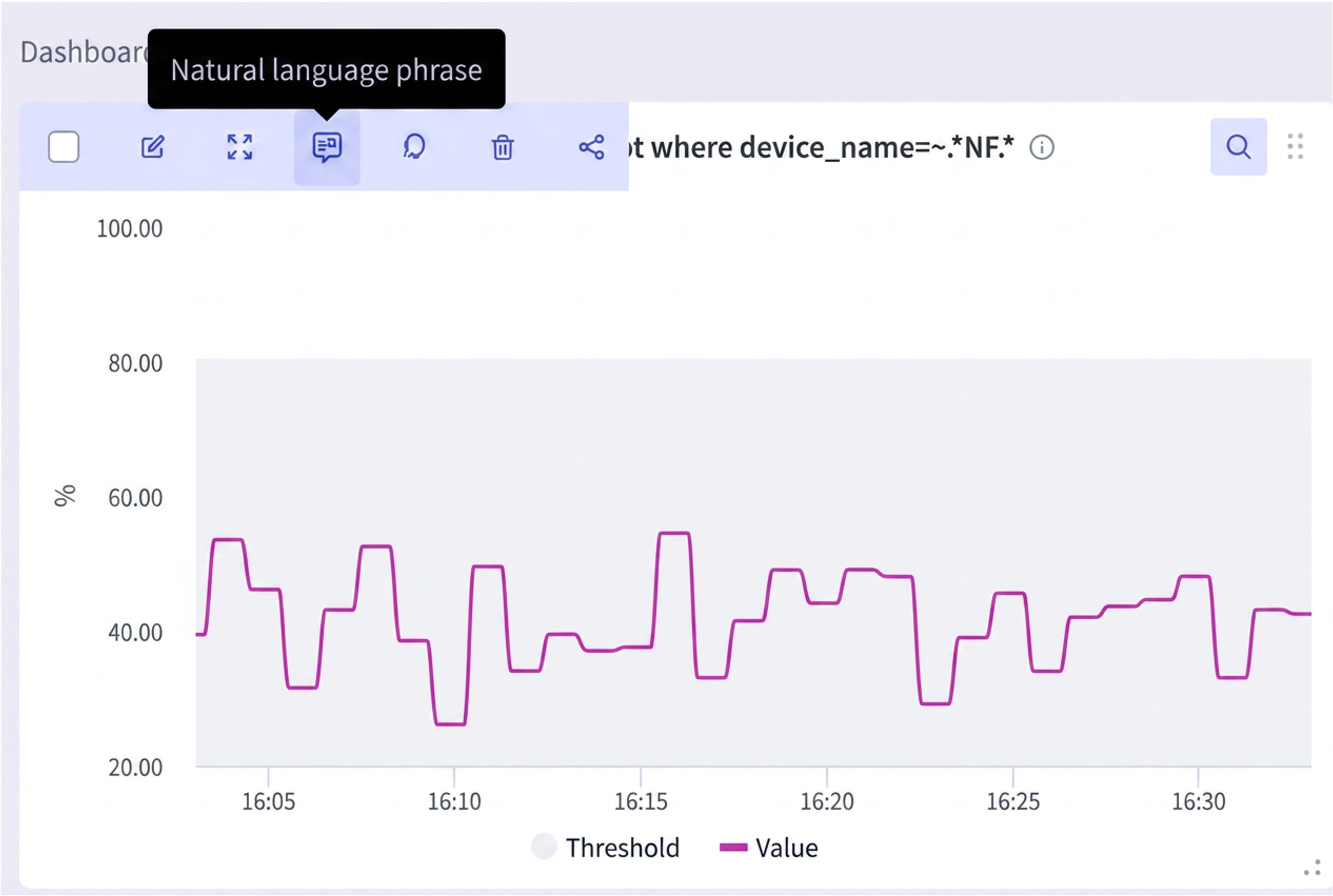
When you click on the natural language phrase option on the dashboard widget, a dialog box appears prompting the user to enter a natural language phrase for the widget’s S2QL query.
This example uses the following natural language phrase for the widget’s S2QL query: “CPU Utilization for NF* Devices”
Once formulated, this natural language phrase (NL phrase) can be used anywhere in the S2 platform web GUI as well as from Slack or Teams (assuming that Slack or Teams have been integrated with the S2 platform):
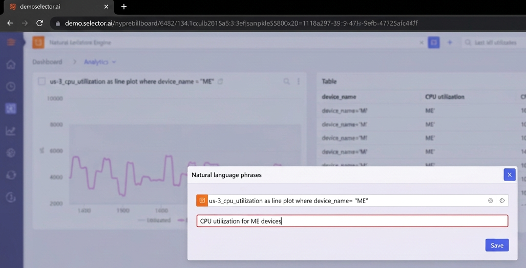
For more information on Selector Integrations, see Selector Software Integrations
Editing a Widget
Clicking on Edit takes the user to the Query Builder where the widget can be modified:
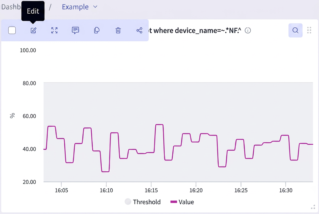
Additionally, the widget query can be modified by clicking on the Edit button top left in the maximized widget.
Clicking Edit triggers the Query Builder to allow the modification of the widget:
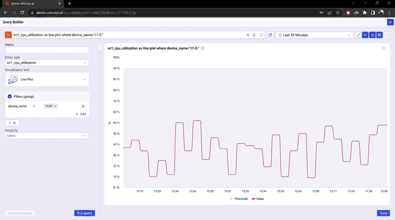
There are several things to remember when modifying a widget with the Query Builder. Here is the full process using an example.
In this example, the user wants to change the widget’s visualization type from Line Plot to Timeline Heatmap (green, yellow, and red show object status).
To do this, in the Query Builder, click the Visualization type dropdown and select the Timeline Heatmap visualization option:
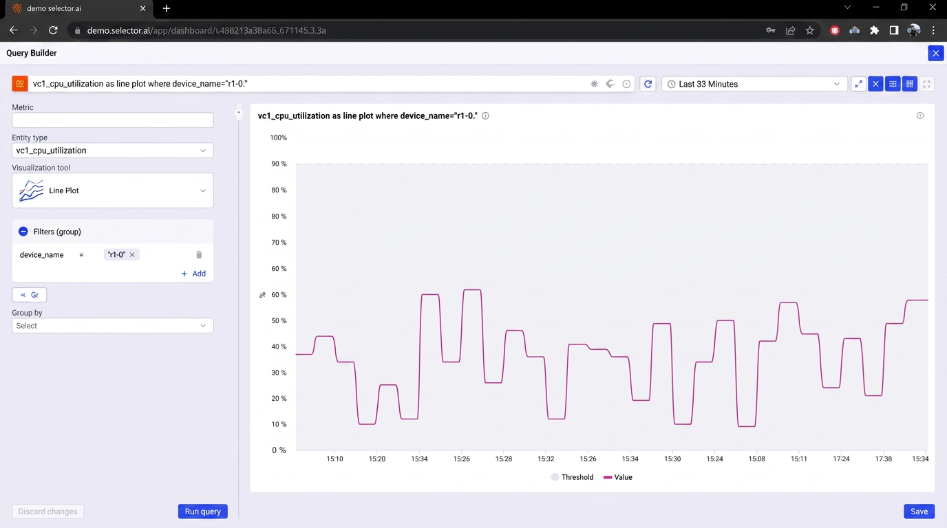
Next, click the Run Query button at the bottom of the Query Builder interface. The widget does not change and update unless Run Query is clicked, and it is not possible to save the widget with the new visualization type unless the query has been run first:
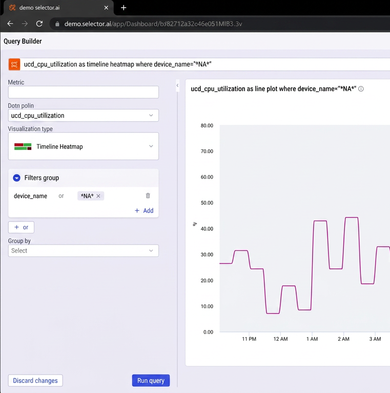
After the update query has been executed, the updated output is displayed. Verify that this information is the expected output and click Save on the Query Builder interface. Note the change in the format of the widget:
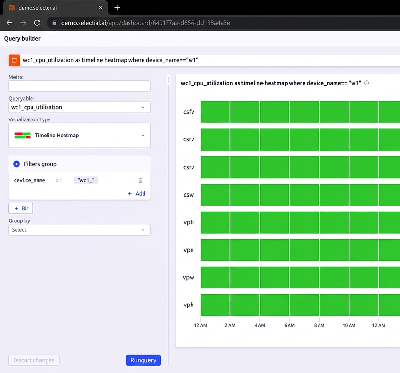
A message window appears confirming that the updated widget has been successfully saved:
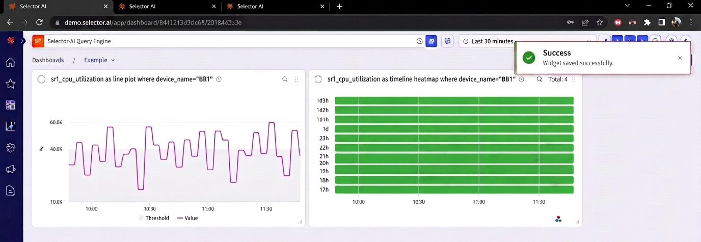
The updated widget now appears in the dashboard and can be moved or resized normally:
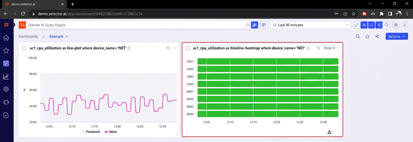
More widget basics are presented in the Widgets and the Query Builder section of this document.
Maximizing a Widget
You can maximize the widget to fill the entire interface. To do so, click on the Expand icon of the widget.
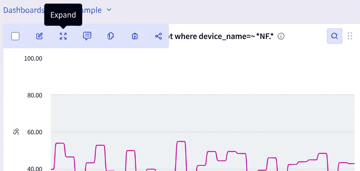
When the Expand option is clicked, the widget expands to fill the entire interface. Note that the time range controls are still displayed when the widget is maximized:
Copying a Widget
You can copy a widget to a different dashboard. To do so, click the Copy to dashboard icon of the widget:
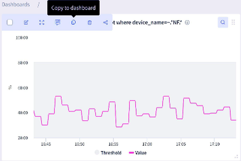
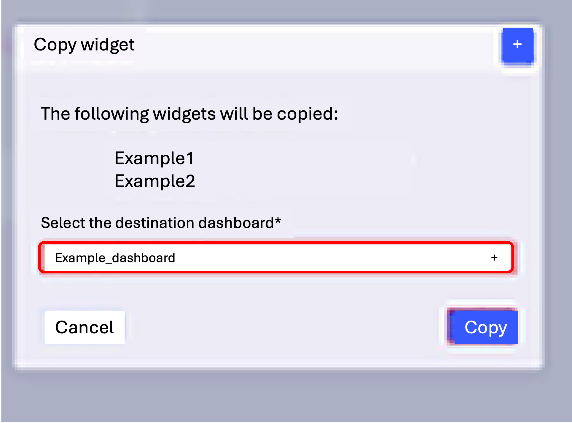
When the Copy to dashboard icon is clicked, a dialog box appears asking the user to select the destination dashboard. Select the desired dashboard from the dropdown menu and click Copy:
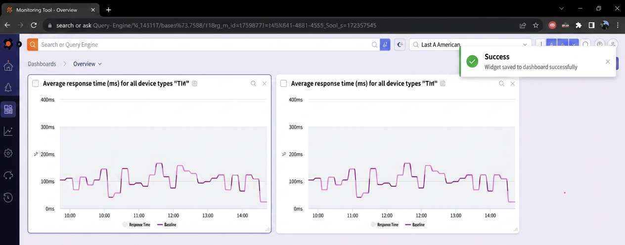
The copy should complete nearly instantaneously, and the user is taken to the destination dashboard for the widget copy. A success message appears indicating that the copy was successful:
Deleting a Widget
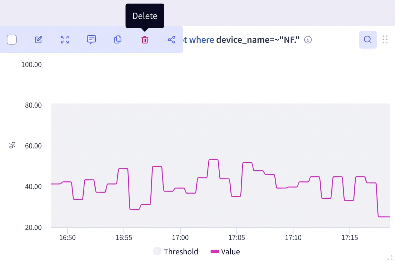
You can delete a widget from a dashboard. To do so, click the Delete icon of the widget:
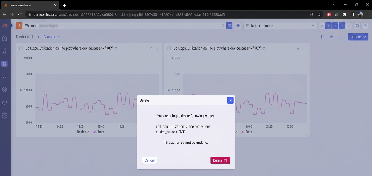
When you click Delete, a dialog box appears which displays the S2QL query of the widget being deleted. A message also warns that this action cannot be undone. Verify that the correct widget is being deleted and click Delete:
Sharing or Exporting a Widget
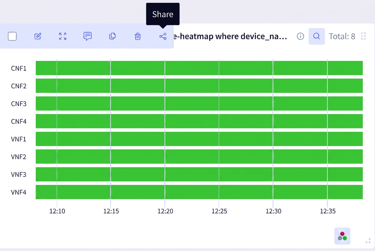
You can share the widget’s URL or export a widget to a PDF file from a dashboard. To do so, click the Share icon of the widget:
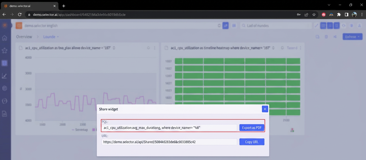
A dialog box appears, providing two options. First, there is an option to export the widget as a PDF. This ability can be very useful for collaborative needs such as reporting, ticket updates, and documentation:
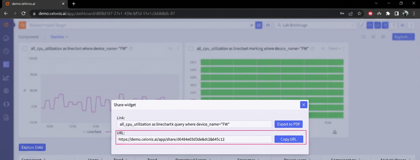
The second option, Share, allows the widget’s URL to be exported and shared:
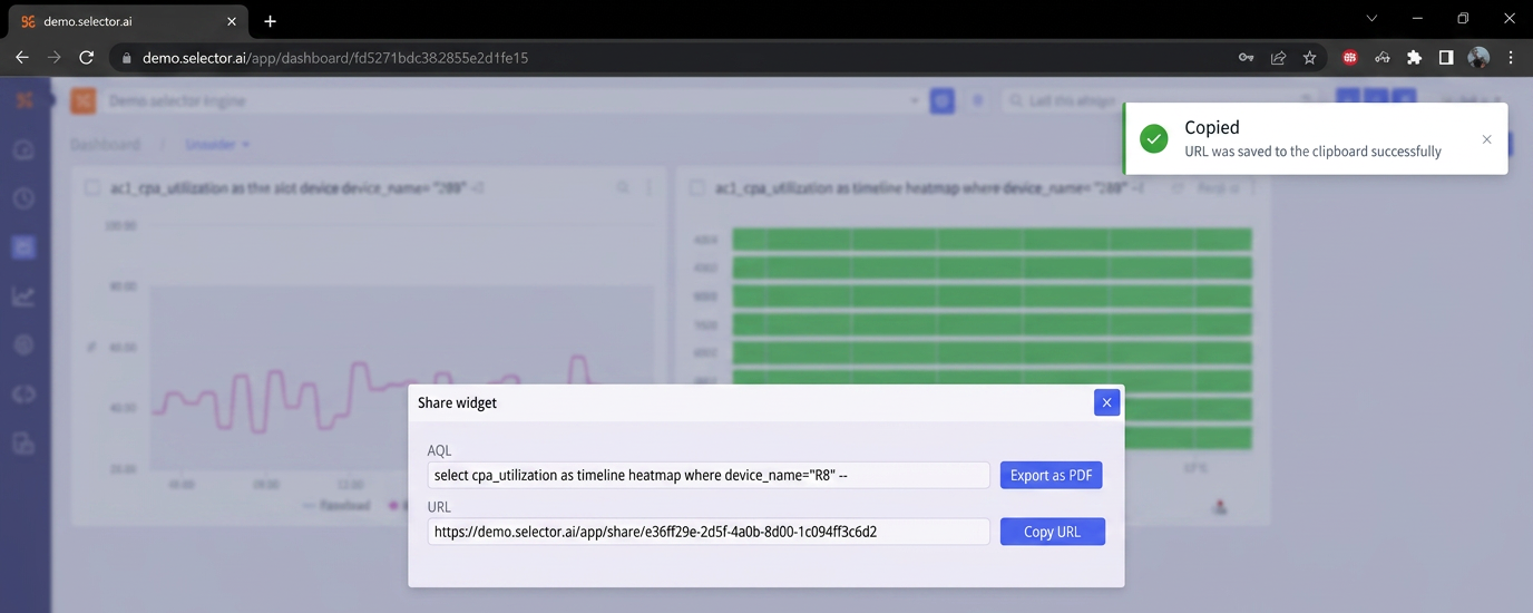
The widget’s URL is copied to the clipboard and a copied success message appears:
Searching a Widget
You can search a widget for specific information. To do so, click the Search input prompt of the widget:
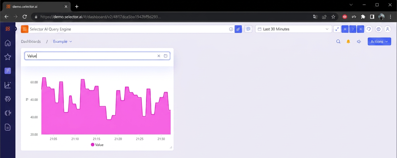
In this search example, the term Value is entered. This causes to widget to only display the search result. Other information, such as the gray auto-threshold indicator is obscured.
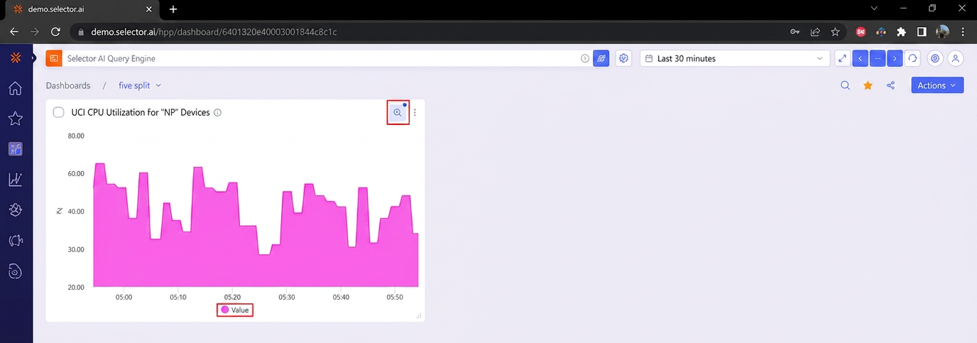
When the user clicks away from the widget, the searched value remains prominent, and the widget’s output remains filtered to the search term.
NOTE: The search icon now displays a blue dot indicating that it is displaying search results.
3 - Selector S2AP Operations Guide - Integrations and Alerts
Selector Software Operations - Integrations and Alerts
Selector Software Operations Guide - Part 3
This part of the S2AP Operations Guide describes the fundamentals of alert handling for the S2AP platform from Selector AI Software.
There are various integrations which provide the necessary linkage for the S2 platform to ingest data from your infrastructure. These integrations can be added, configured, tested, or removed. Integrations comprise the backbone of the S2 platform because they are the data ingestion points for the entire solution.

For more information on Selector Software integrations, see the following:
The Alerts Interface
This section explores the alerting configuration of the Selector UI. This section is composed of six sections, each of which is covered in depth in this section:
- Creating Alert Rules: Establish the rules used for alerts
- Modifying Global Alert Settings
- Alert Events: Alert IDs and incidents
- Suppressed Alert Events: When to ignore alert conditions
- Alert Incidents: How alerts become events and incidents
Creating Alert Rules
The alert rules interface allows you to create, import, export, copy, modify, mute, and delete alerting rules:
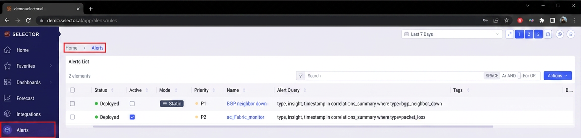
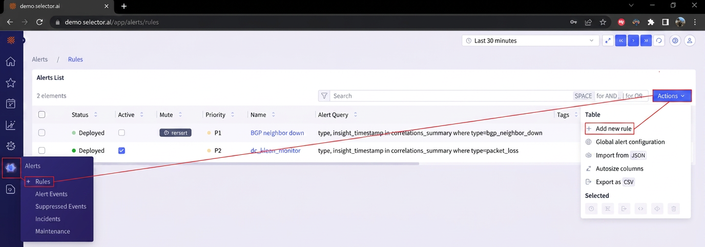
To create a new alert rule, navigate to the Alerts menu and click Rules. Then click Actions and select + Add new rule:
The following settings need to be defined in the Alert Rule Builder:
- Alert Name
- Alert State (Active/Inactive)
- Alert Priority
- Notification
- Dedup Timer
- Notification Timer
- Description
- Tags
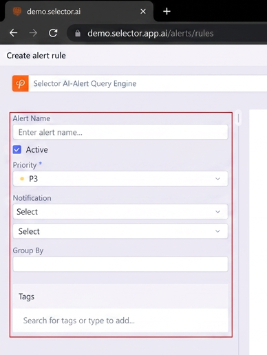
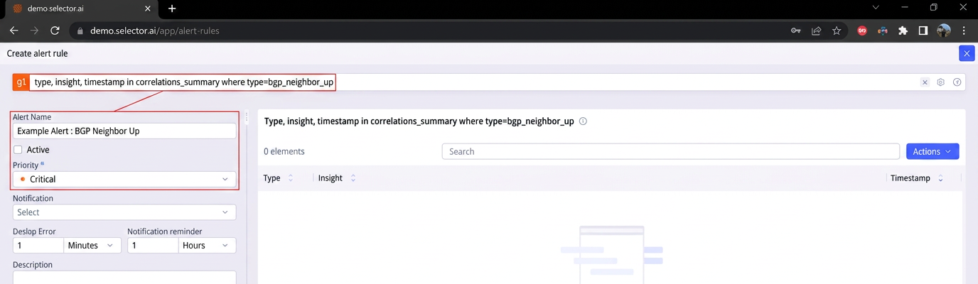
For example, consider the following S2QL query:
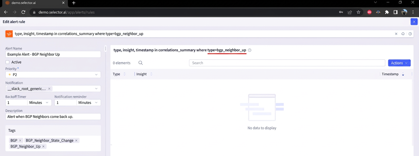
type, insight, timestamp in correlations_summary where type=bgp_neighbor_up
For this example, the alert name is Example Alert - BGP Neighbor Up. The alert is set to inactive for the time being until the alert has been built and has been confirmed to be correctly configured. Note that by default, new alerts are set to Active.
Alert priorities range from P1 (highest) to P5 (lowest). This example alert is given the default priority of P3:
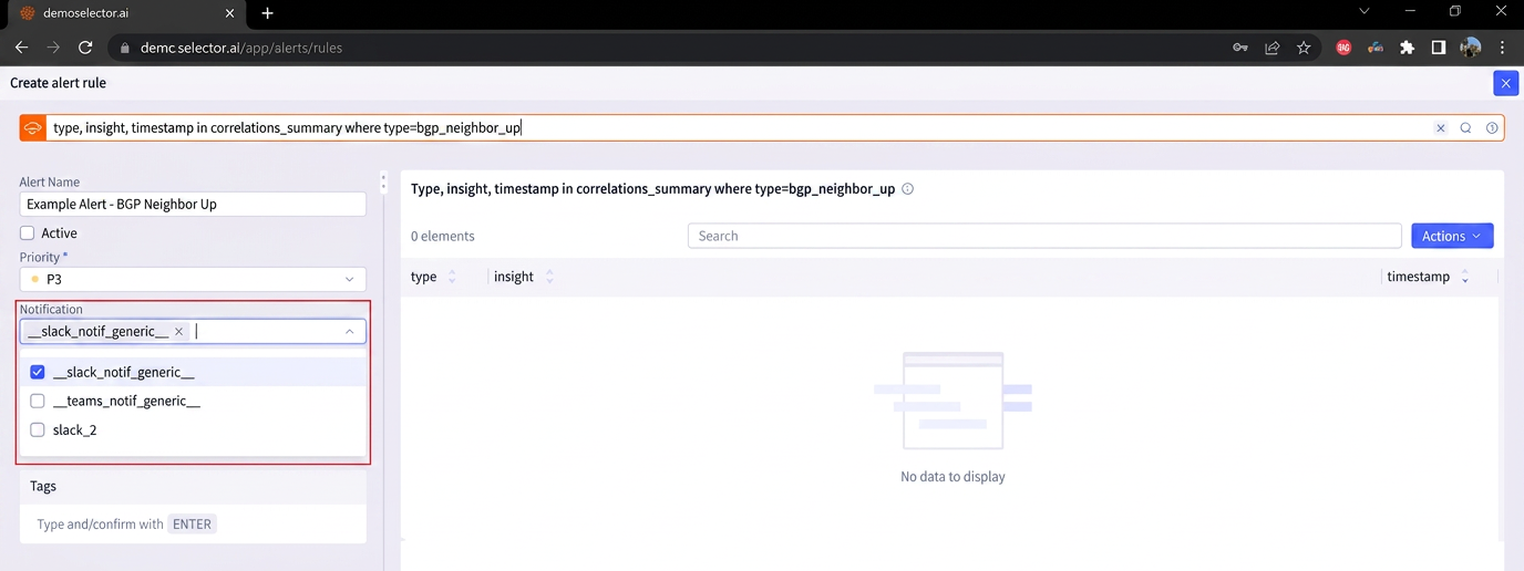
Next, define the notifications setting by clicking the Notifications dropdown menu and selecting the relevant notification provider for the alert. The notification providers are configured in the Integrations interface under the Notification Provider Integration under the Workflow Integrations section.
Note that multiple notification providers can be selected in the alert rule configuration. For this example, the slack_notif_generic___ notification provider is selected:
Next, in this example, the Dedup Timer is set to 5 minutes. The data deduplication timer (dedup timer) is used to eliminate redundant data generated during an alert, cutting down on processing and storage requirements and improving efficiency. Duplicate alerts are ignored during this time period.
The following time settings can be used for the Dedup timer:
- Days
- Hours
- Minutes
- Seconds
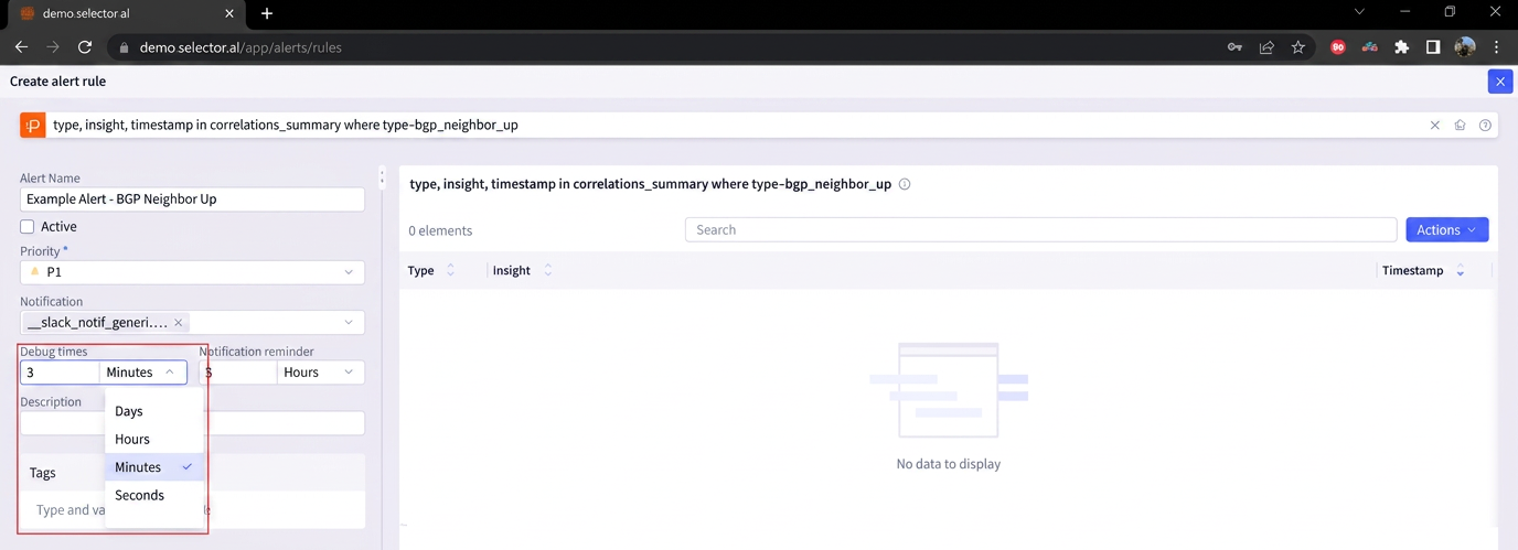
In this example, the Notification timer is set to 5 hours. The following time settings can be used for the Notification timer:
- Days
- Hours
- Minutes
- Seconds
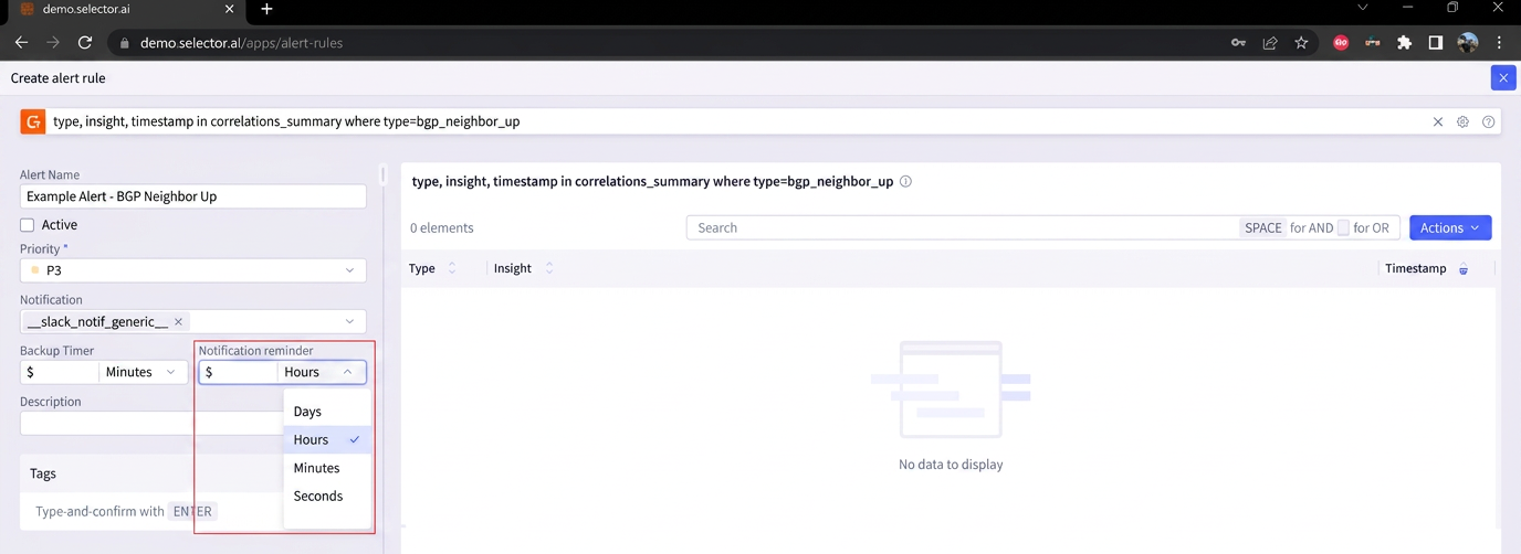
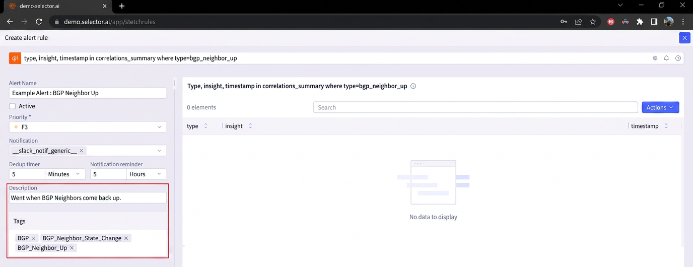
You also need to define the description and any desired tags. For this example, the description is Alert when BGP Neighbors come back up.
The following tags are used for this alert rule:
- BGP
- BGP_Neighbor_State_Change
- BGP_Neighbor_Up
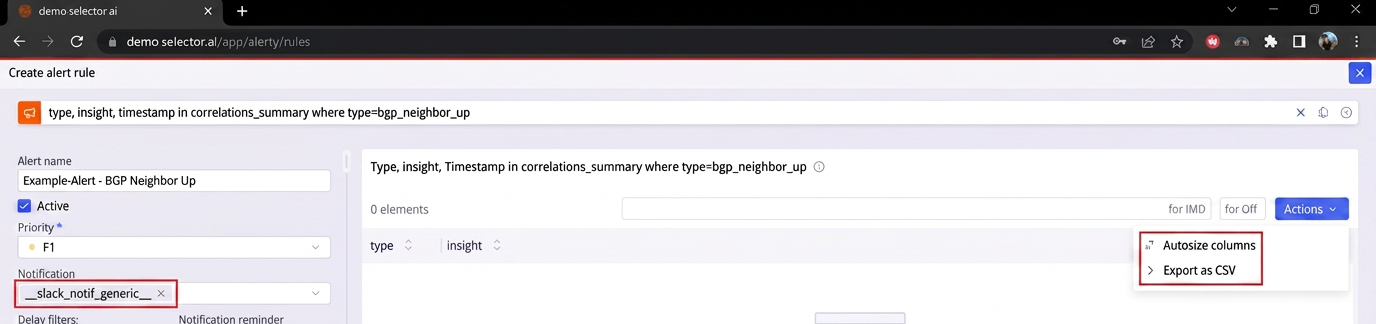
Note that there is an Actions button at the top of the Alert Rule Builder interface. If the alert rule creates an output in the Alert Rule builder, two options are provided by the Actions button:
- Auto-size columns
- Export as CSV
When all the parameters have been set, click the Create Alert Rule button at the bottom of the Alert Rule Builder interface. This returns the user to the Alert Rules interface. The new Alert Rule appears on the list of alert rules:
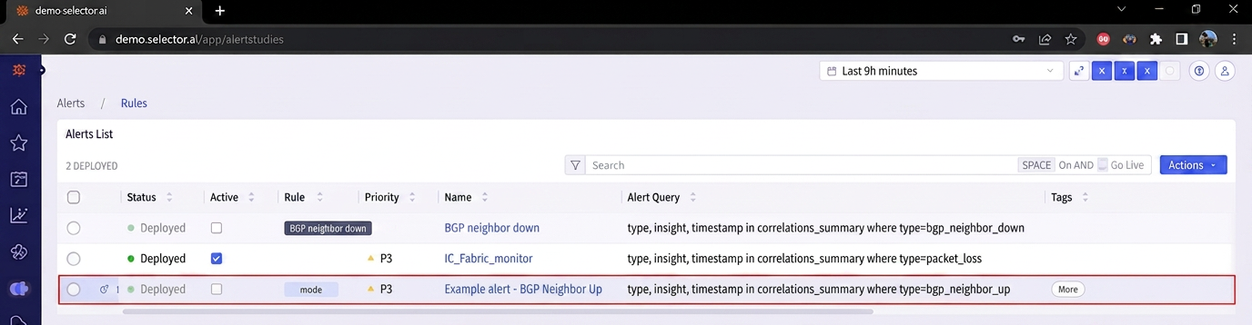
Note that there are two columns indicating the state of the alert rule:
- Active
- Mute
Both settings can be modified directly from the Alert Rules interface.
Working with Alert Rules
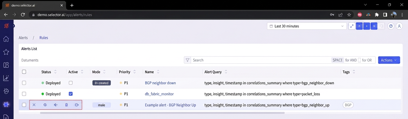
Hovering over the left of an alert rule reveals a slide out menu containing the following options:
- Edit
- Copy
- Mute
- Delete
- Share
Editing an Alert Rule
You can edit an alert rule by hovering over the left of the alert rule and clicking on the Edit icon:

The Alert Builder interface opens and all of the alert rule properties can be modified:
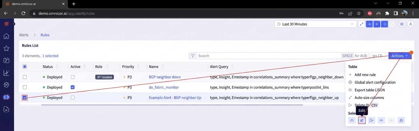
You can also edit a rule using the Actions Menu in the Alert Rules interface. To do so, check the box to the left of the desired alert rule, click the Actions button at the top of the Alert Rules interface. Then select Edit on the Actions Menu:
Duplicating an Alert Rule
To duplicate an alert rule, hover over the left side of the alert rule in question and select the “Duplicate” icon:

The Alert Builder interface opens to allow the configuration of the duplicated alert. By default, no alert name is specified, and all settings are inherited from the source alert rule:
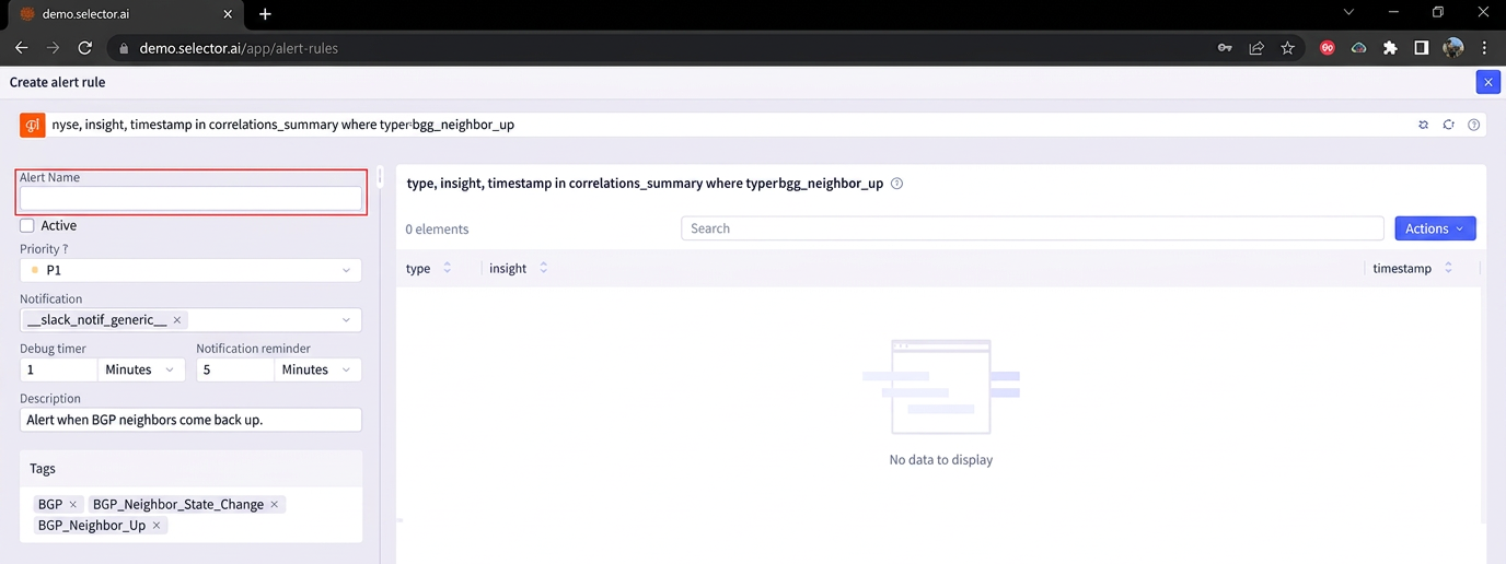
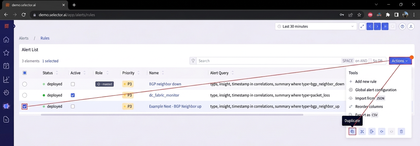
Note that a rule can also be duplicated from the Actions Menu in the Alert Rules interface. To use this method, check the box to the left of the alert rule, click the Actions button at the top of the Alert Rules interface. Then click Duplicate from Actions Menu:
Muting an Alert Rule
You can “mute” an alert rule to prevent it from sending out notifications through the notification provider. There are several ways to mute and arlet rule.
One way to mute an alert rule is to hover over the left of the alert rule and select the Mute icon:
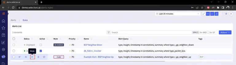
An alert rule can also be muted by clicking the Mute icon on the alert rule display.
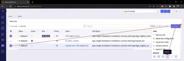
A rule can also be muted from the Actions Menu in the Alert Rules interface. Check the box to the left of the desired alert rule, then click the Actions button at the top of the Alert Rules interface. Click Mute on the Actions Menu:
Alternatively, the notification provider configuration for the alert rule can be blank to mute the rule because the notification provider is not required to create an alert rule.
Deleting an Alert Rule
You can delete an alert rule if the rule is no longer needed. To delete an alert rule, hover over the left of the alert rule in question and select the “Delete” icon:
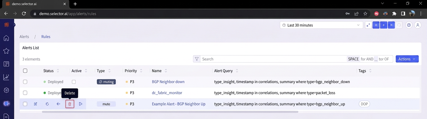
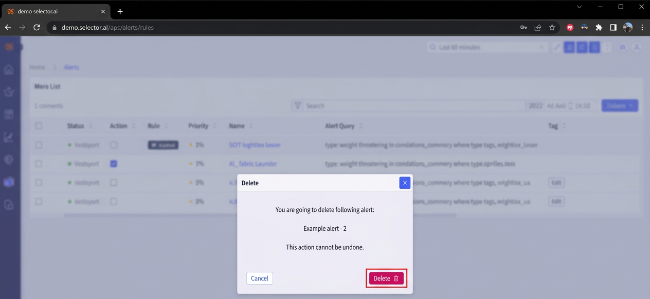
A dialog box confirms the alert rule being deleted and warns that the deletion of the alert rule cannot be undone. Click Delete to complete the deletion:
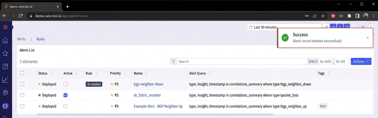
A success message confirms successful deletion of the alert rule:
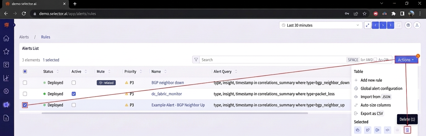
You can also delete a rule from the Actions Menu in the Alert Rules interface. Check the box to the left of the alert rule, then click the Actions button at the top of the Alert Rules interface, Click Delete from the Actions Menu:
Exporting an Alert Rule
You can export an alert rule to be downloaded as a JSON file, or as a CSV file.
To export an alert rule as a JSON file, hover over the left of the alert rule and click the Export icon:

You can also export an alert rule as a JSON file from the Actions Menu in the Alert Rules interface. Check the box to the left of the alert rule, then click the Actions menu at the top of the interface. Click Export at the bottom of the Actions menu:
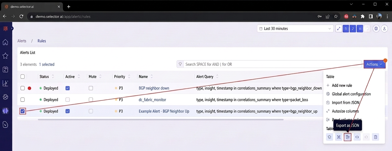
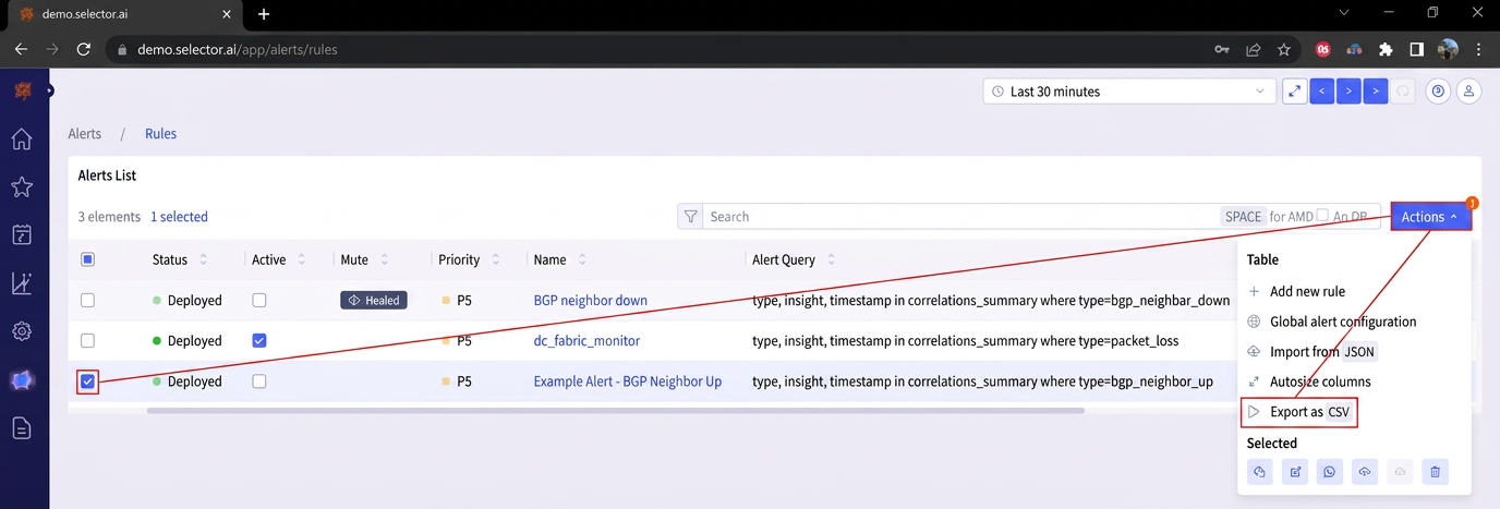
To export an alert rule as a CSV file, check the box to the left of the alert rule, then click the Actions button at the top of the Alert Rules interface. Click Export as CSV from the dropdown action list:
Testing an Alert Rule
There are several reasons to test an alert rule, such as for debugging, regulatory examination, UAT compliance testing, or to check for rule accuracy.
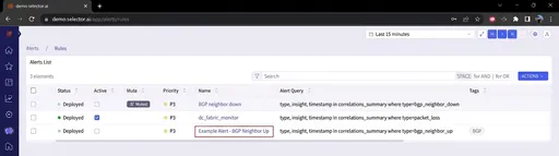
To test an alert rule, navigate to the Alert Rules interface and click the name of the alert rule:
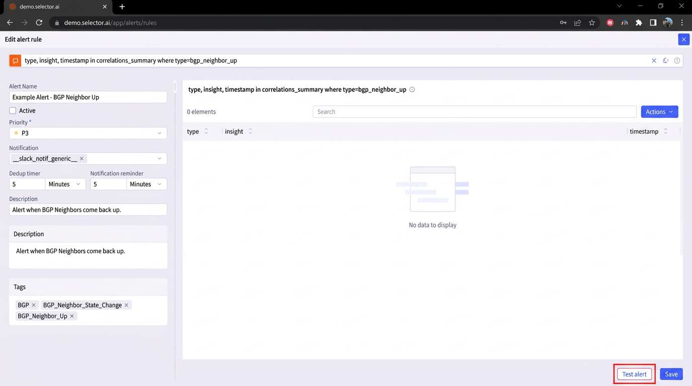
Click the Test alert button at the bottom of the Alert Builder interface:
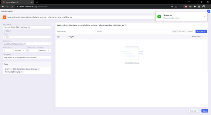
The alert rule test should take only a couple of seconds to complete. A success message appears confirming that a mock alert has been triggered:
The results of the test are sent to any notification provider that has been configured on the system and applied to the alert rule. Check the relevant notification system and verify that the alert arrived as intended.
If any difficulties are encountered, or the alert rule test produces an error message, please bring this to the attention of the Customer Success Engineer assigned to your account. They troubleshoot the process with your account’s solutions engineer.
Modifying Global Alert Settings
There are two alert settings which are global in scope:
Dedup timer controls the dedup frequency
Notification reminder frequency
By default, these have a global configuration of 5 minutes and can be modified for the customer’s requirements.
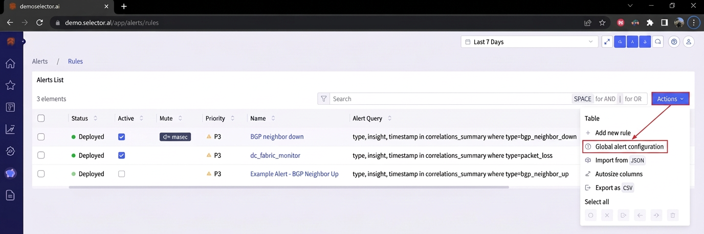
The alter these settings, click the Actions button on the Alerts List and select the Global alert configuration option from the dropdown list:
A dialog box will appear allowing Make your modifications to the Dedup timer and Notification reminder settings in the dialog box:
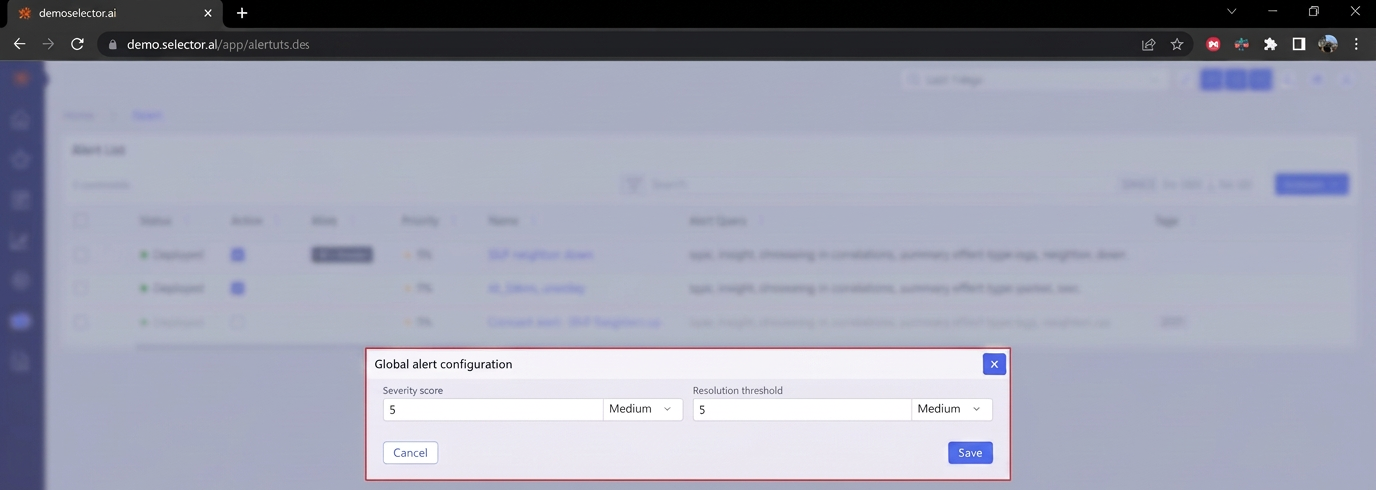
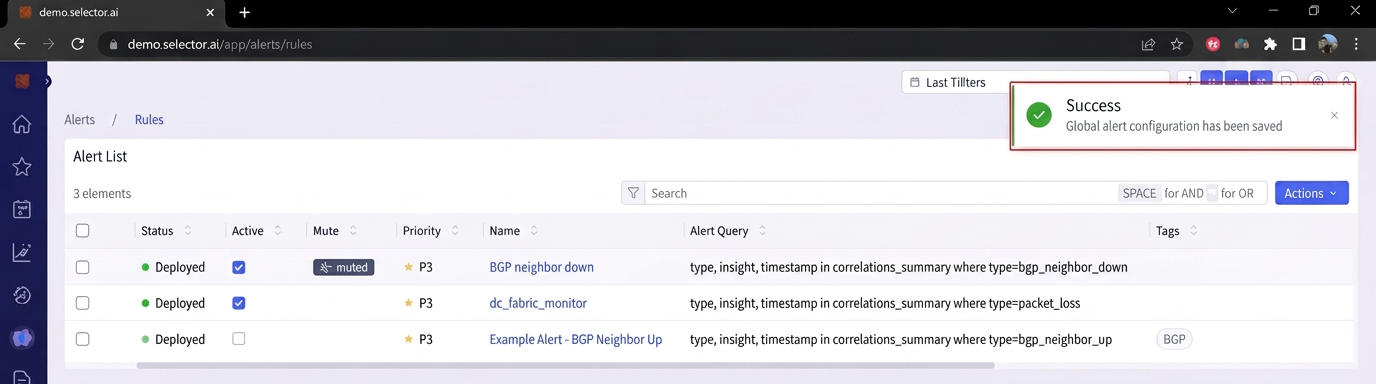
Update the values and click Save. A success message appears to confirm that the settings have been successfully changed:
Note that these defaults can be overridden for each alert.
Alert Events
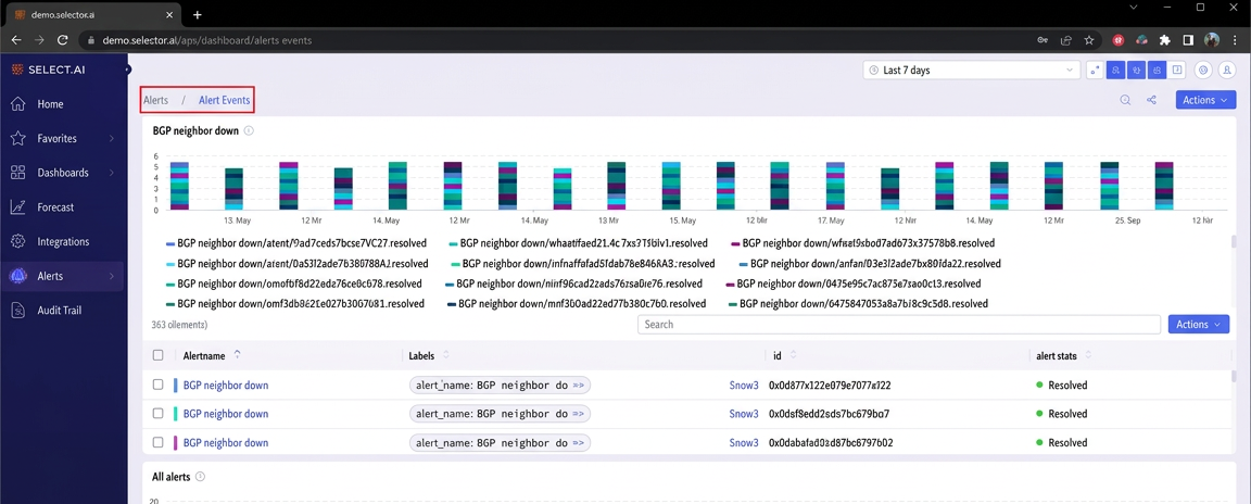
The Alert Events dashboard captures and displays instances of the defined alert rules. The dashboard detects violations and initiates alert notifications. By default, the widgets in the Alert Event dashboard are manually configured and initially populated by your account’s Solutions Engineer.
The widgets in the Alert Events dashboard use the stacked-event-plot visualization by default:
Alert IDs
Every alert is given a unique alert ID. The alert ID is displayed In the stacked-event-plot widget along with the state of the alert (either firing or resolved):
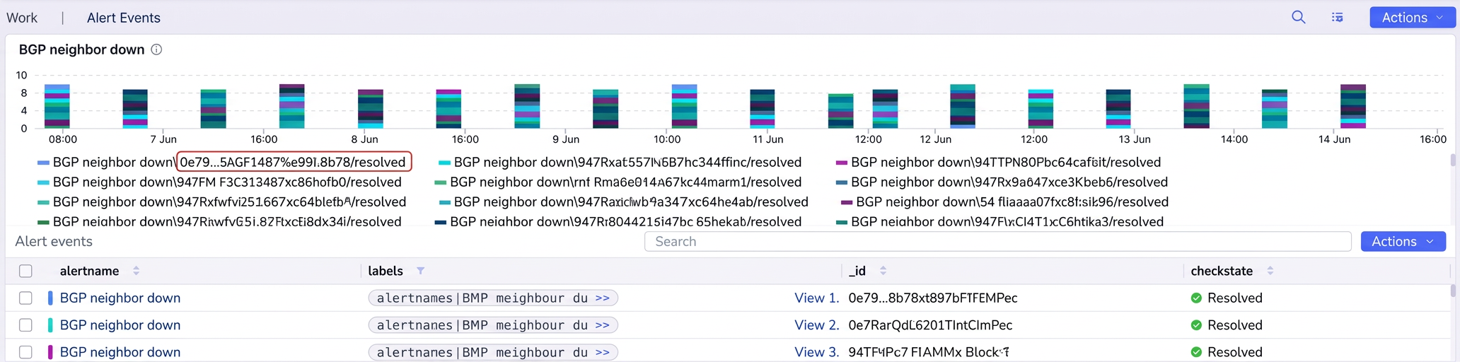
The same information is also displayed below the stacked-event-plot widget:

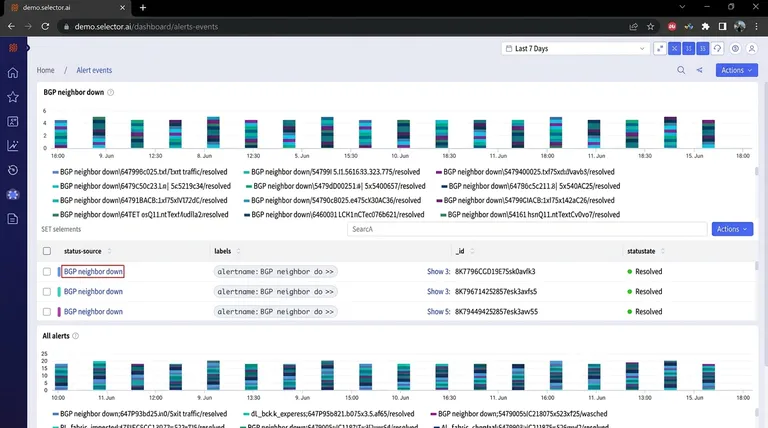
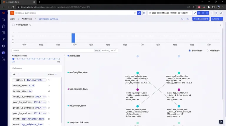
Clicking on an alertname in the stacked-event-plot widget displays the correlations page for that alert:
The correlations page displays additional events related to the displayed alert event. The correlations page operates on a displayed events confidence score. Initially, the interface displays only the events that have a 90% or high confidence score. The slider is used to display additional events with lower confidence scores for additional context:
Working with Alert Events
You can take several actions with the widgets on the Alert Events dashboard.
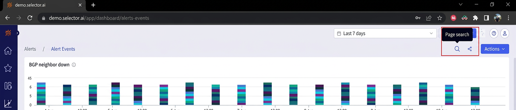
Two Quick Action buttons are at the top of the Alert Events dashboard:
- Page Search
- Share dashboard
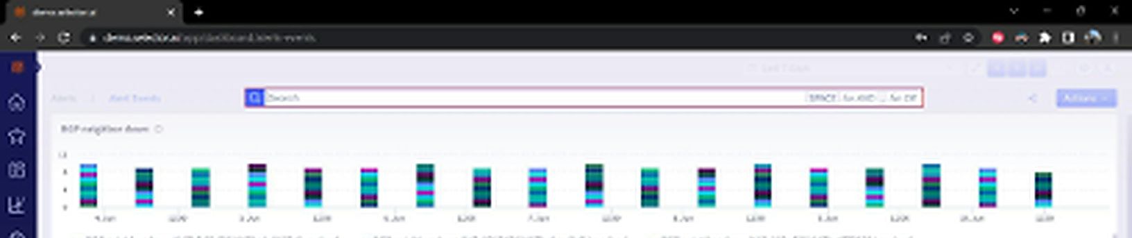
Clicking Page Search presents an input bar to enter search terms:
Hit Enter to start the search:
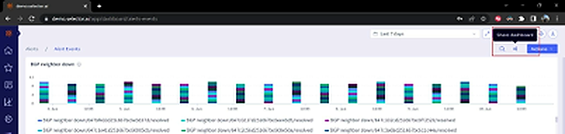
The other button, Share dashboard, allows you to share the dashboard’s URL:
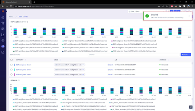
A success message appears confirming that the dashboard’s URL has been copied to the clipboard:
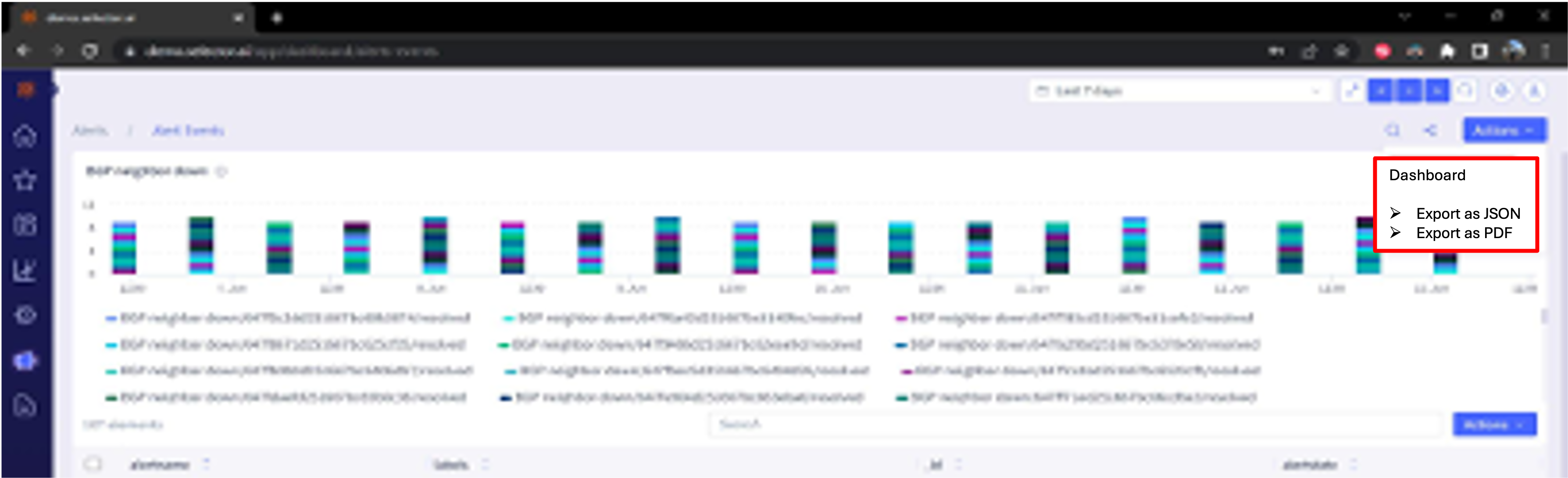
All dashboards are exported as a JSON file or a PDF file:
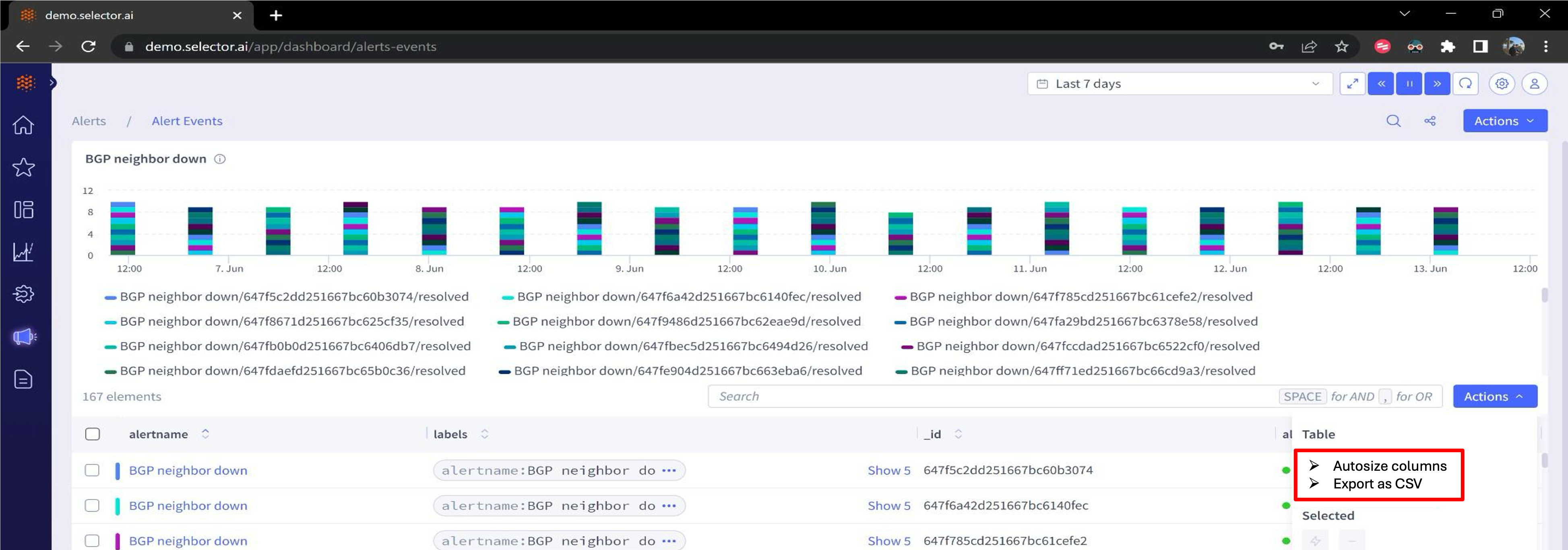
All widgets of this type can be auto-sized and exported as a CSV file:
Adding Alert Events to Incidents
Alert events can be added to an incident. An incident is a collection of events related to a specific larger scope issue (the incident) detected by the system.
More on creating and managing incidents is covered in the section Alert Incidents.
Consider a situation where numerous hosts go offline around the same time, and a configuration change was made which shut down a LAG port. All of these events can be added to an incident named Partial User Access Outage in Building 3.
The search bar built into this stacked event plot widget allows a search for a specific event.
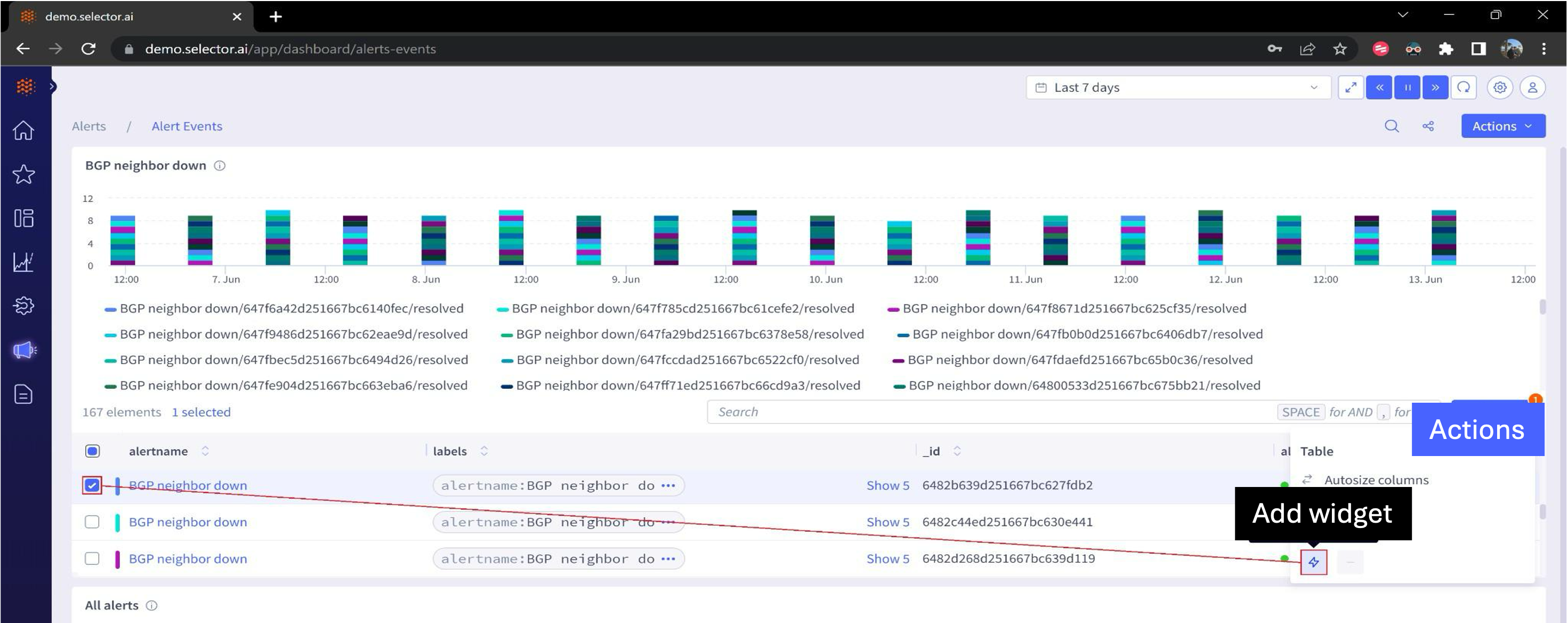
For the situation outlined above, the example adds the top event in the list to an incident by checking the box for the desired incident. Then click the Actions button on the widget and select Add Widget:
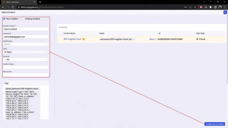
The Add to incident button opens the Incident Builder interface. Configure this incident and then click the Create incident button:
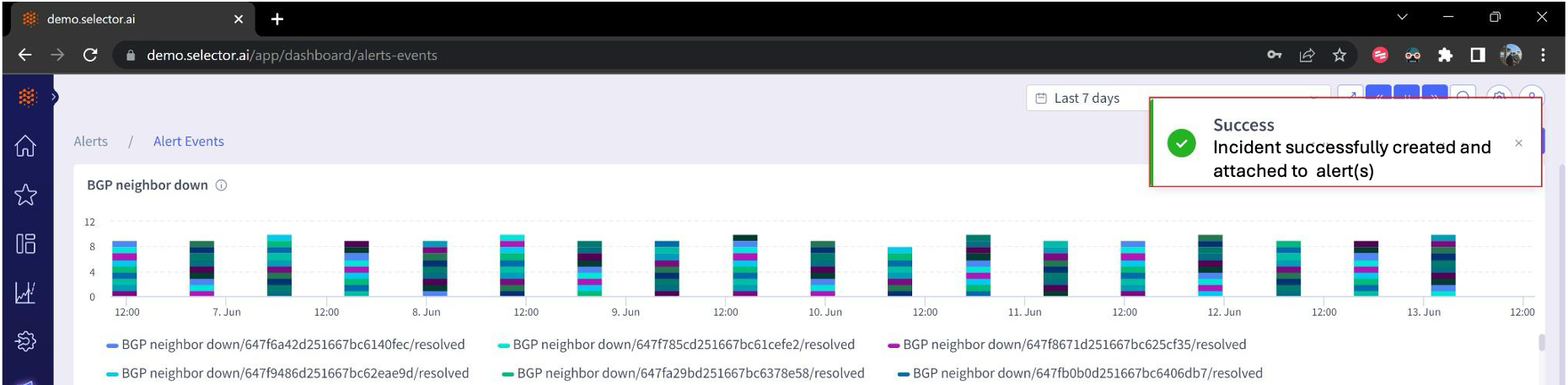
A success message appears confirming that an incident was created and the selected alerts were successfully added:
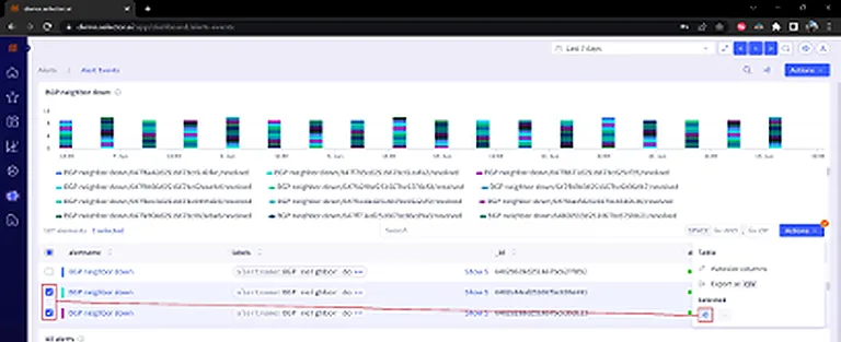
If adding an alert to an existing incident, the process is slightly different. In that case, select the alerts and then click the Actions button and select Add to incident:
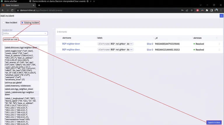
To add selected alert events to an existing incident, select the Add to existing incident radio button and then select the incident from the dropdown list. Then click Save incident:
A success message appears confirming that the selected alerts were attached to the incident:

Suppressed Alert Events
The suppressed alerts interface displays a dashboard populated with widgets detailing information about suppressed alerting rules, usually due to a planned maintenance window or from alerts that have been muted:
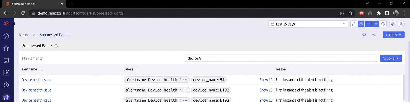
The Page search and Share dashboard quick action buttons are available. The dashboard also can be exported as either a JSON or PDF file.
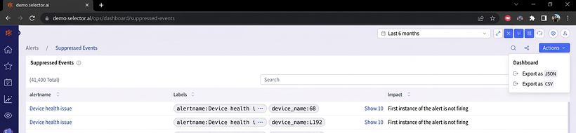
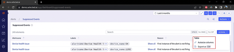
All widgets allow output to be autosized and exported to a CSV:
Alert Incidents
The Incident interface displays a dashboard populated incidents manually created in the S2 interface. Incidents allow alert events to be associated with a particular situation. The incident
Interface displays several key pieces of information about each defined incident:
- Incident name
- Username of the person who created the incident
- Notification
- State (open/resolved)
- Impact scope
- External identifier (ticket number)
- Tags (S2 labels)

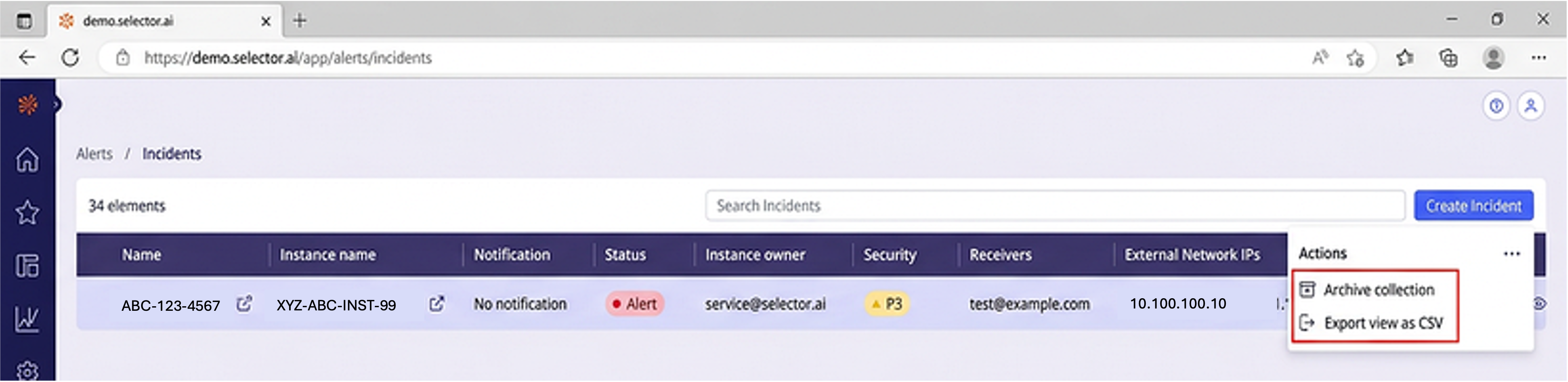
The incidents widget output can be autosized or exported as a CSV file from the Actions menu:
Creating a New Incident
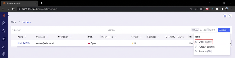
Create a new incident by selecting New Incident from the Actions menu at the top right of the widget:
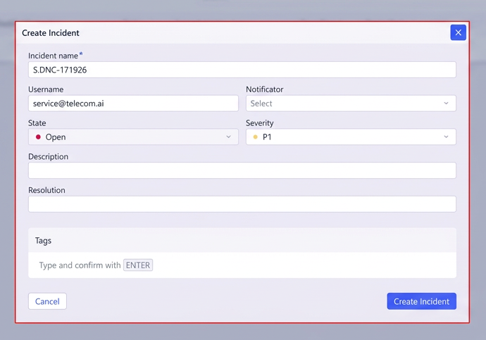
The Incident Builder interface appears, prompting the user to enter several pieces of information:
- Incident name
- Username
- Notification
- State
- Severity
- Impact Scope
- Resolution
- Tags
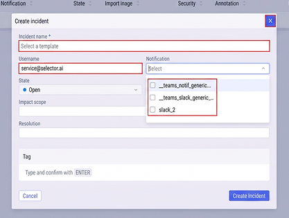
As you work your way through the incident creation interface, begin with the Incident name, Username and Notification. If your environment has a prescribed naming convention for incidents, make sure to follow that convention.
Enter the username of either the person who reported the incident or the person who created the incident (depending on your environment’s policies).
Select the appropriate notification provider from the dropdown menu:
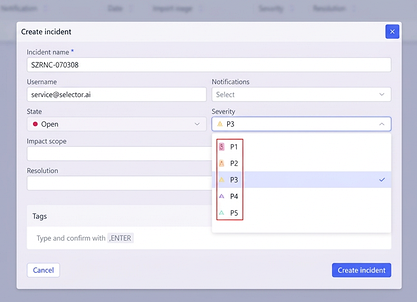
Then define the priority of the incident, P1 through P5, with P1 being the highest priority and P5 being the lowest. P3 is the default priority for new incidents. The alert state cannot be altered when creating an incident, this can only be changed once the incident has been created:
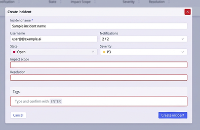
Next, enter the impact scope and, if applicable, resolution. Usually, the resolution is left blank during incident creation and updated during incident closure. Additionally, tags can be added during incident creation and if alert events are added to the incident. Tags (S2 labels) from the alert events will automatically be added to the incident’s tag (S2 label) list.
The Impact scope field is unique to the incident. For example, a phrase such as User access impacted for all users on the third floor of building 5 or BGP routes for the finances application were unexpectedly withdrawn are helpful to put the incident in context.
The Resolution field is normally left blank at incident creation (unless the incident is being created retroactively). An example of a resolution is Bouncing the router X3/0/0/1.100 interface caused the missing BGP routes to be announced correctly.
Finally, click the Create incident button:
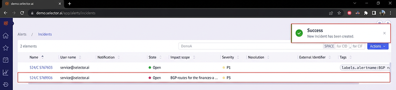
A message appears informing the user that the incident has been created successfully. The incident is added to the incident list:
Viewing Incident Details
By default, clicking on an incident name in the incidents list takes the user to a blank dashboard displaying the Add widget button:
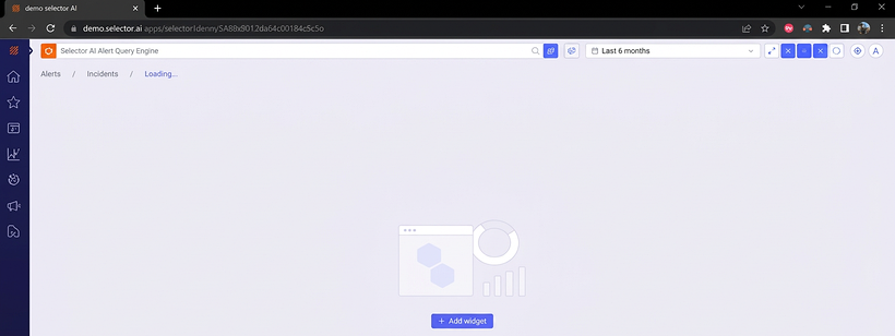
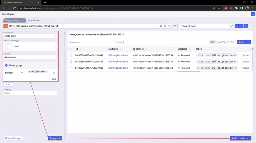
Clicking Add widget opens the Query Builder interface. The query is built with a table and a name. The alerts_state is a table where the incident is set to the incident_name. This directs the system to use the alerts_state KPI/metric and display it as a table. The output is filtered to only alert events that are attached to the desired incident. For this example, the exact query used is:
alerts_state as table where incident=S2INC-5767583
Click the Run query button and verify that the widget successfully displays the correct output.
When satisfied, click Add to dashboard:
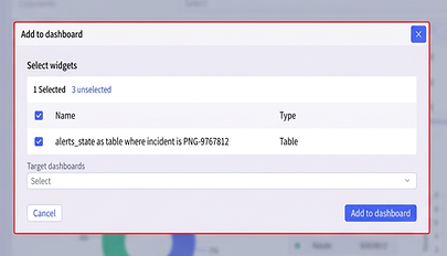
A dialogue box appears displaying the S2QL query used for the widget and prompting the user to select the destination dashboard:
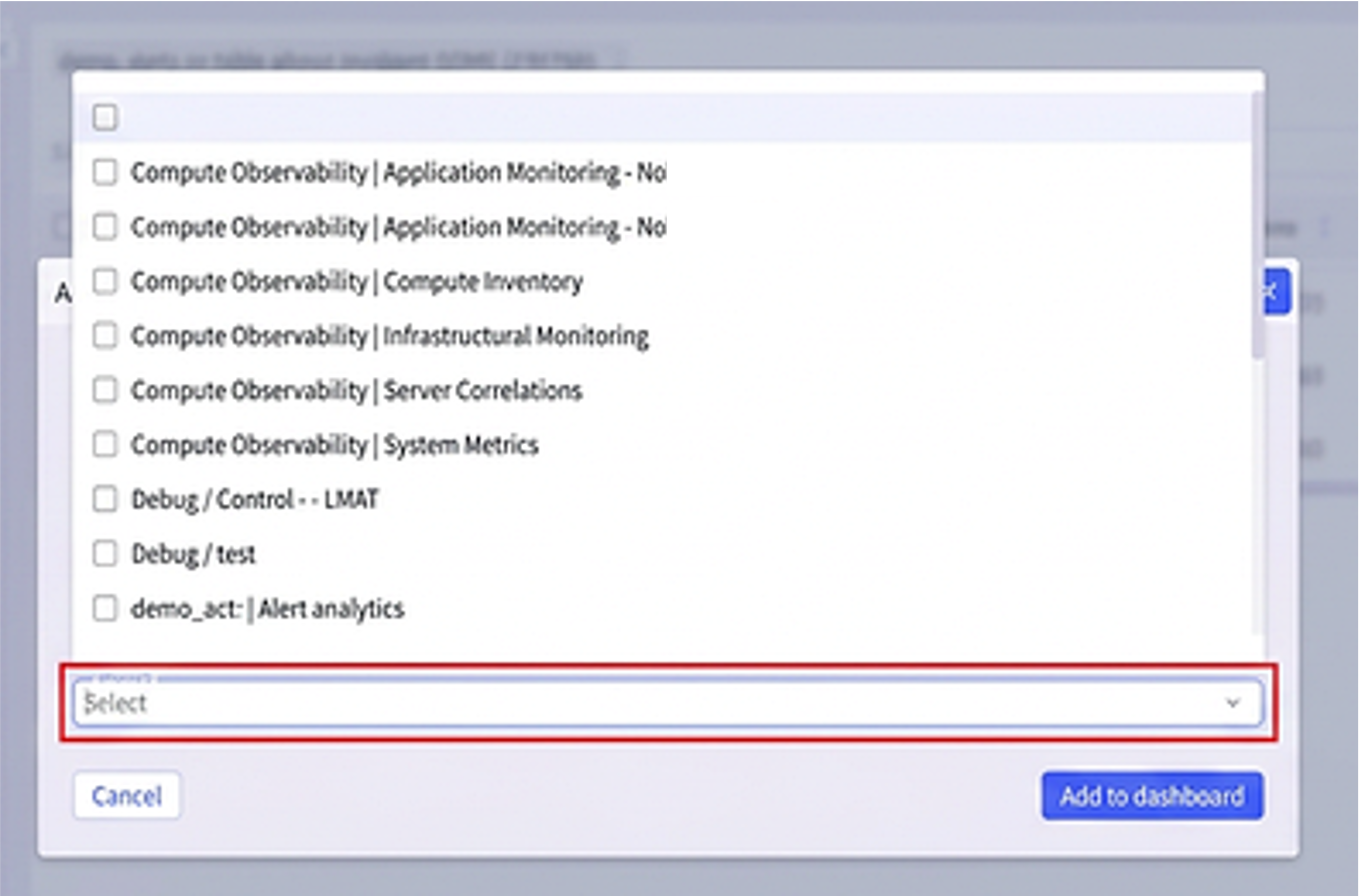
Click the Target dashboards dropdown menu and select the top entry (it will be blank), Then click the Add to dashboard button:
The new widget is visible in the incident’s dashboard. However, it will render at the default widget size. To adjust the widget’s size, click the dots at the bottom of the widget and adjust its size:
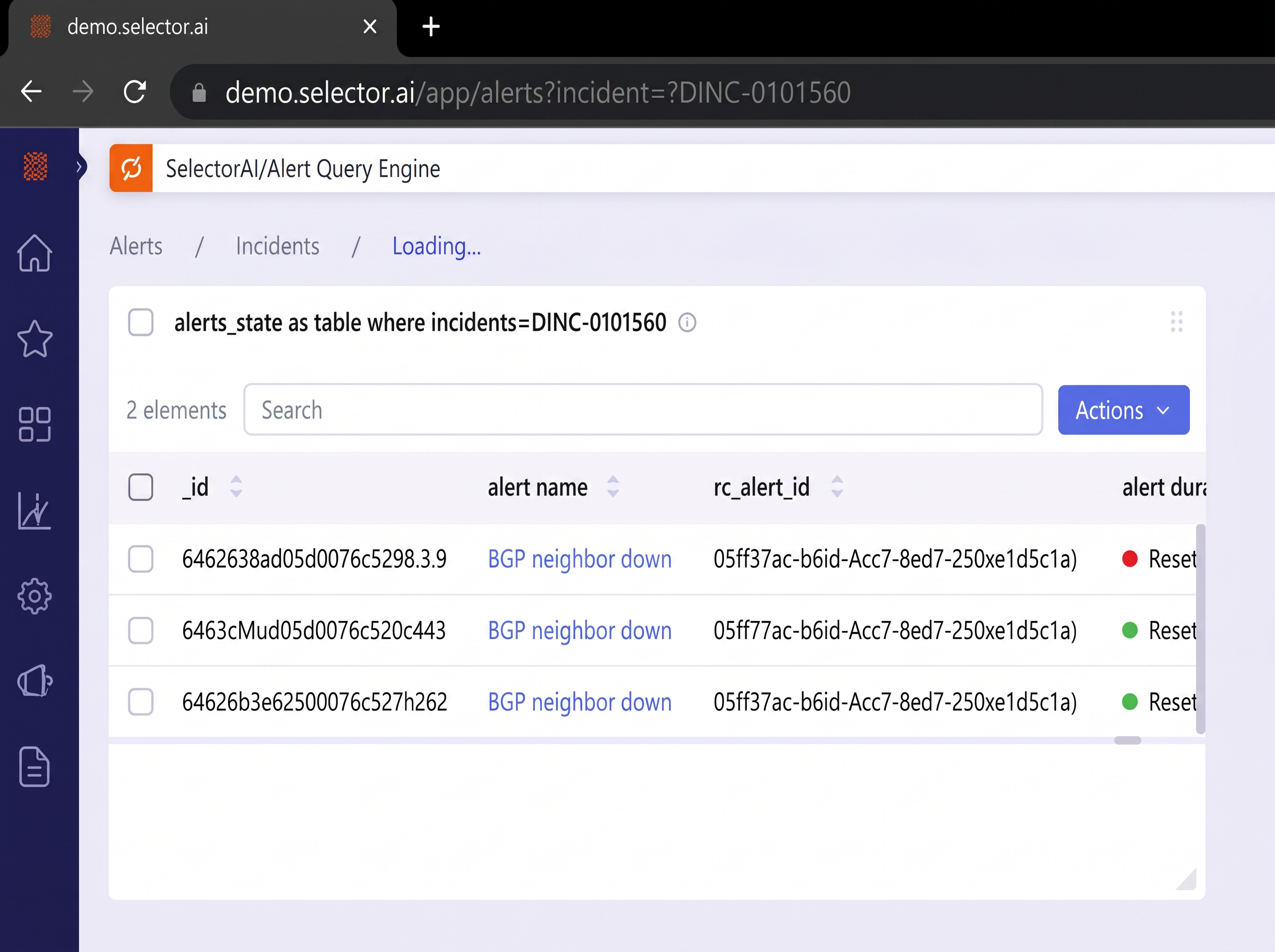
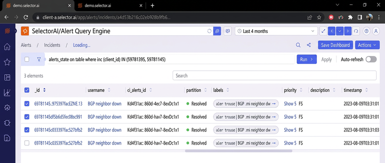
Once the size is adjusted, you can view the widget in its entirety. Once the dashboard is adjusted to your satisfaction, click Save Dashboard:
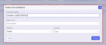
Enter details about the dashboard in the dialog box that appears. Enter dashboard name, dashboard folder (if required), global setting and favorite setting. Then click the Create button:
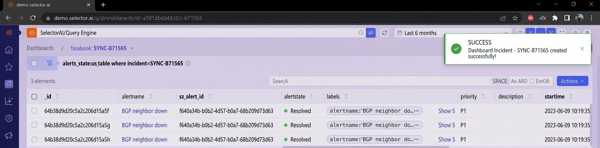
A message appears confirming successful creation of the dashboard:
Modifying and Resolving an Incident
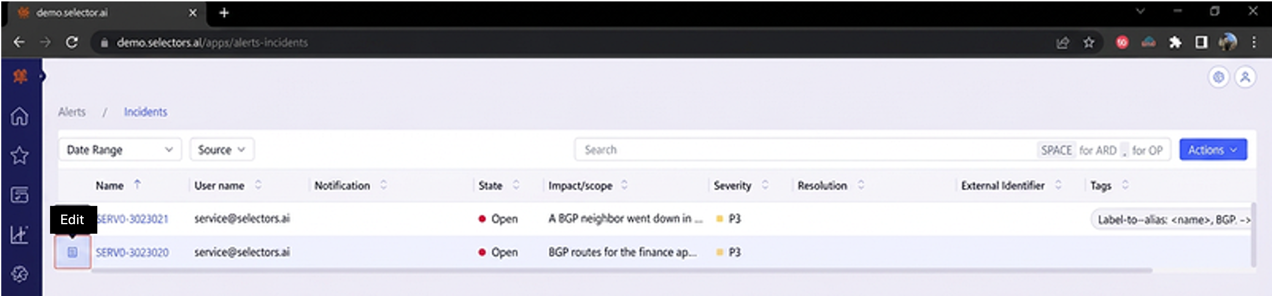
To modify or close an incident, click on the edit button to the left of the incident:
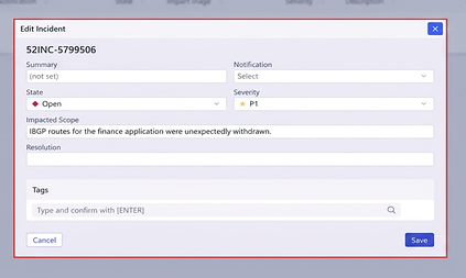
From the incident configuration interface, you can update any of the displayed settings or enter the resolution details and change the state of the incident to closed.
Click the Save button at the bottom right of the interface once updates are completed:
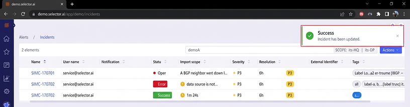
A success message appears confirming that the incident updates were successfully saved. Also, notice that if the incident was resolved, that state updates to resolved:
Remove an Alert Event from an Incident
There are two ways to remove an alert event from an incident:
- Using the alert event dashboard
- Using the incident’s dashboard
When using the Alert Events dashboard, there is a good chance that new alerts have occurred and are at the top of the list of alert events. This can make the desired alert events challenging to locate. Find the alert event ID from the list of alerts attached to the incident and use the widget’s search bar to find the specific alert:
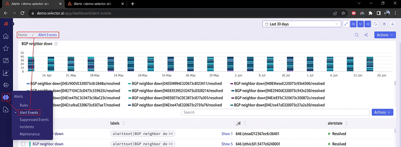
To remove the alert event, check the box to the left of the alert event. Next, click the Actions button on the right side of the widget and then click the Detach from incident button at the bottom of the dropdown menu:
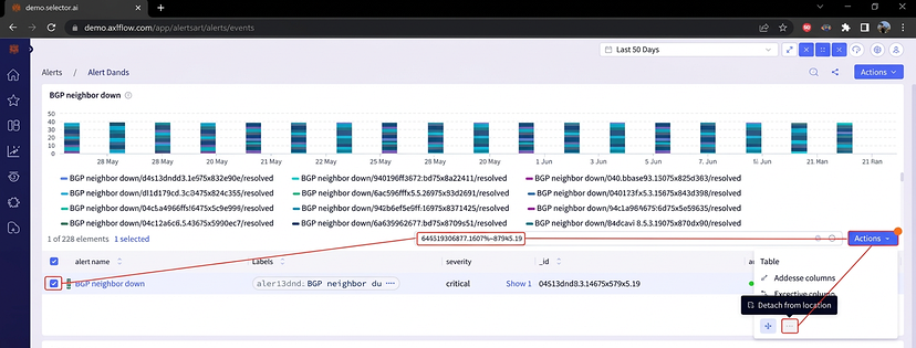
When using the incident’s dashboard, locate the desired alert event to be removed and check the box to the left of the alert event. Next, click the Actions button on the right side of the widget and then click the Detach from incident button at the bottom of the dropdown menu:
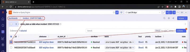
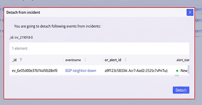
A dialogue box appears confirming the alert event removal from the incident. Verify that information is correct and click the Detach button at the bottom right of the interface.